
Your favorite paint shade reveals a lot about your personality, mood, and even subconscious desires. Warm colors like reds and yellows suggest energy, confidence, and a passion for creating inviting environments. Cool hues like blues and greens often indicate a calm, reflective nature, seeking tranquility and balance. Neutrals show a preference for simplicity and inner peace, while jewel tones and dark shades hint at confidence and sophistication. To uncover more about what your color choice says about you, keep exploring the deeper meanings behind your favorite shades.
Key Takeaways
- Warm, saturated shades often indicate a confident, energetic personality that values social connection and creating welcoming environments.
- Cool, soft hues typically reflect calm, thoughtful individuals who prioritize tranquility and emotional balance.
- Neutral colors suggest a desire for simplicity, clarity, and inner peace, emphasizing harmony and self-reflection.
- Bold jewel tones reveal creativity, ambition, and a tendency to stand out with sophistication and depth.
- Dark shades convey a preference for mystery, power, and intimacy, highlighting a sophisticated or introspective nature.
The Psychology of Warm Colors and What They Reveal About You
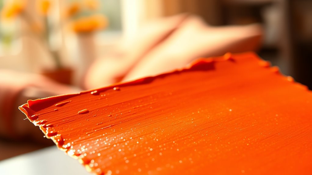
Warm colors like red, orange, and yellow are more than just visually appealing—they reveal a lot about your personality. In color psychology, these hues symbolize energy, enthusiasm, and friendliness. When you favor warm tones in interior design, it suggests you’re nurturing, social, and thrive in lively environments that spark conversation and activity. Bright, saturated shades often indicate confidence and optimism, showing your desire to create inviting, energetic spaces. On the other hand, softer warm shades hint at a gentle, caring nature that values comfort and emotional connection. Your preference for warm colors reflects an expressive, approachable personality motivated by warmth and positivity. These choices in your environment reveal your personality traits—outgoing, passionate, and motivated by creating welcoming atmospheres. Additionally, Victorian-inspired designs often incorporate warm, rich hues to evoke a sense of elegance and tradition, highlighting your appreciation for historical depth and craftsmanship in your personal style. Understanding the color psychology behind warm hues can further enhance how you express your personality through your environment. Recognizing the psychological effects of color can help you intentionally select shades that align with your desired mood and self-image.
Cool Hues and the Calm Personalities Behind Them
If you’re drawn to cool hues like blues and greens, you likely value calmness and clarity in your environment. These soothing colors reflect personalities that seek tranquility and emotional stability, often making spaces feel more restful. Incorporating cool tones can promote relaxation and trust, aligning with a peaceful, dependable outlook. Using unique and wicked planters in your decor can further enhance this serene atmosphere by adding creative and calming elements to your space. Additionally, understanding the nutritional information behind certain foods can support your overall well-being and mood. Engaging in mindfulness practices like meditation can deepen your sense of peace and emotional balance, further complementing your preference for tranquil environments. Practicing spirituality and mindfulness daily can strengthen your connection to the Vortex, fostering a greater sense of inner calm and emotional stability. For those who appreciate culinary experiences, creating a harmonious atmosphere can enhance both mood and social interactions.
Soothing Color Qualities
Cool hues like pale blues and lavenders have a calming effect that promotes relaxation and tranquility, making them ideal for spaces meant for rest or reflection. These soothing colors are inspired by nature—sky, water, and open fields—helping lower stress levels and foster a peaceful environment. Their lower saturation and brightness make cool shades easier on the eyes, enhancing comfort. To prevent spaces from feeling too distant, adding hints of warm tones creates balance and warmth. People drawn to these colors often value serenity, clarity, and emotional stability, seeking environments that support mindfulness and inner peace. Additionally, these colors can have a positive impact on emotional expression and creativity, encouraging a sense of calm that nurtures artistic inspiration and personal growth. Incorporating natural materials, such as linen and wood accents, can further amplify the tranquil atmosphere of a space. The presence of automation technologies in design and education can further enhance the effectiveness of these serene environments. Moreover, leveraging fraud prevention tools ensures that digital environments remain secure and trustworthy, supporting the peace of mind that these calming spaces aim to foster. Utilizing dog quotes for reflection and humor can also bring a lighthearted and thoughtful touch to creating a peaceful ambiance, especially for dog lovers seeking comfort in familiar, joyful sentiments.
Calm Personality Traits
People drawn to cool hues like pale blue, lavender, and soft green often possess calm and reflective personalities that value tranquility and emotional balance. These cool colors evoke serenity and promote stress reduction, making them ideal for spaces where relaxation is key. If you prefer these shades, you likely have a calm personality, appreciating peaceful surroundings that foster clarity and thoughtfulness. The luminous quality of cool hues energizes spaces subtly, helping you maintain a soothing atmosphere without feeling cold or detached. Balancing these colors with warm accents can enhance your sense of warmth and openness, preventing any sense of emotional distance. Additionally, incorporating vertical storage solutions can help maintain a clutter-free environment, further supporting your tranquil mindset. Creating immersive environments with calming colors can amplify your sense of peace and well-being. A well-organized space enhances environmental harmony and contributes to your overall sense of peace. Using color-protecting shampoos can also preserve the vibrancy of your favorite shades and maintain their calming effect over time. Incorporating mindful sound meditation techniques can deepen your relaxation and reinforce your sense of calm. Overall, your affinity for cool tones reflects a gentle, composed nature that prioritizes serenity and emotional stability.
Tranquil Design Effects
The calming influence of cool hues extends beyond individual personality traits to shape the overall atmosphere of a space. When you use cool hues like pale blues, lavenders, and soft greens, you create a soothing atmosphere that promotes calmness and tranquility. These colors evoke personalities that are reflective and peace-loving, making them ideal for areas intended for rest and relaxation. In interior design, incorporating cool tones can lower perceived room temperature and minimize sensory overload, enhancing comfort. The luminous quality of these shades energizes spaces subtly, encouraging quiet contemplation and mental clarity. Additionally, the psychological effects of cool hues can help reduce stress and anxiety, making them especially beneficial in spaces meant for unwinding. To prevent spaces from feeling too distant or cold, adding warm accents balances the overall vibe, fostering a cozy yet tranquil environment perfect for unwinding. Recognizing the emotional impact of color choices can further optimize the calming benefits of cool hues in any space. Understanding the color psychology behind these shades allows designers and homeowners to intentionally craft environments that promote relaxation and mental well-being.
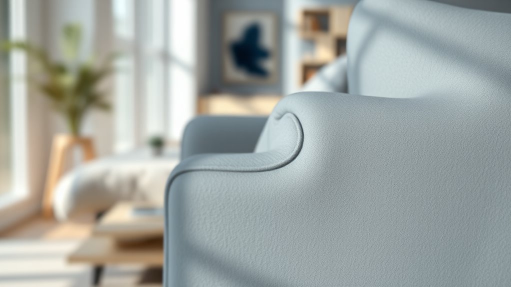
The Significance of Whites and Neutrals in Reflecting Your Inner Self

Whites and neutrals serve as powerful indicators of your inner self, revealing your desire for clarity, order, and peace. In interior design, these shades reflect personality traits rooted in color psychology—whites often symbolize cleanliness, discipline, and simplicity, helping create open, peaceful spaces. Warm parchment tones suggest comfort and warmth, while icy blue hues indicate calm and tranquility. Neutrals like gray, brown, and beige show an appreciation for timelessness, stability, and understated elegance. The way you use these shades—through textures, contrasts, and accents—can reveal traits like minimalism, sophistication, or serenity. Your choice of whites and neutrals isn’t just about aesthetics; it’s a reflection of your inner landscape, emphasizing your need for balance, clarity, and inner peace.
Jewel Tones: Bold Colors That Express Confidence and Creativity
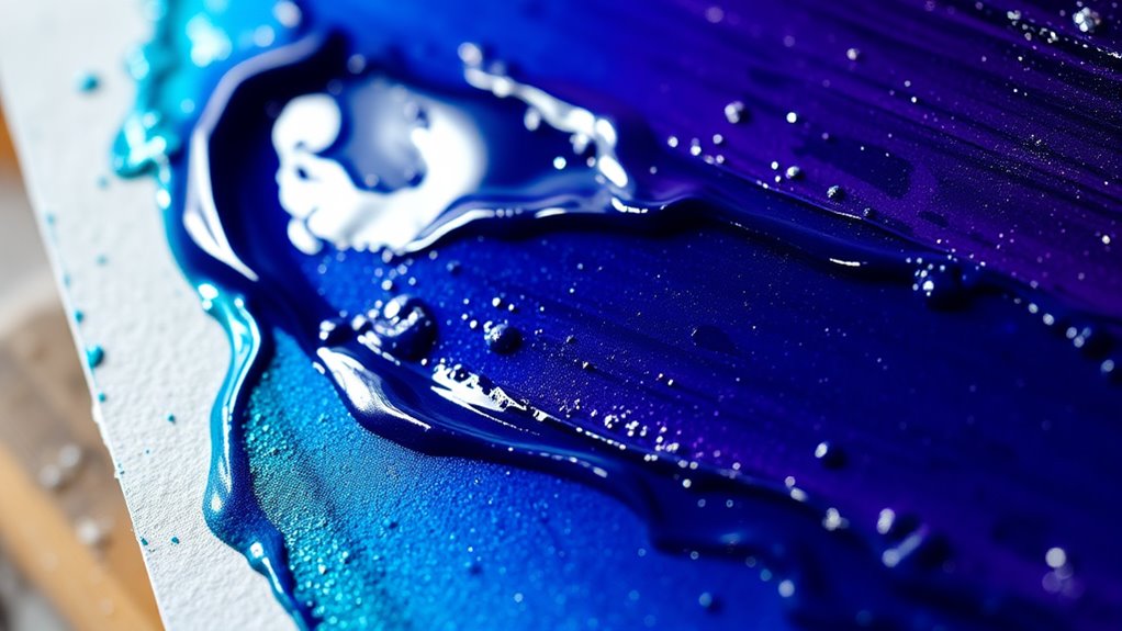
Jewel tones like ruby, emerald, sapphire, amethyst, and topaz stand out as bold, saturated colors that radiate confidence, luxury, and creativity. These rich colors make a striking statement in interior design, adding glamour, warmth, and intimacy to any space. When you incorporate jewel tones, you signal a confident personality and a love for sophisticated style. They’re versatile enough to pair with neutral shades, balancing their intensity, or combined with other jewel hues for a cohesive, daring look. In color psychology, jewel tones are linked to ambition, originality, and a desire to stand out. Using these bold colors in your surroundings or wardrobe helps express a dynamic, outgoing spirit, making a powerful visual statement about your confidence and creative flair.
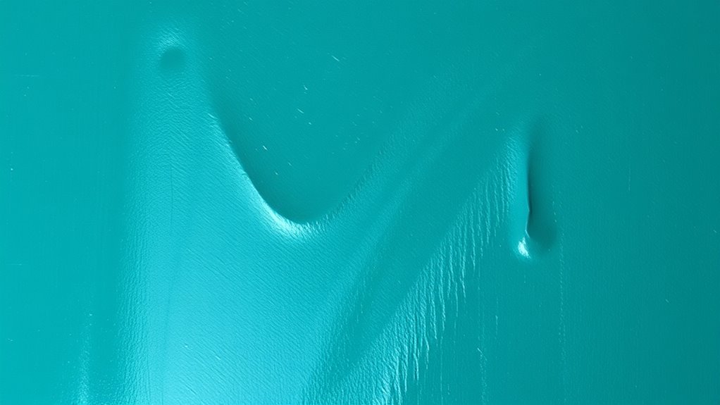
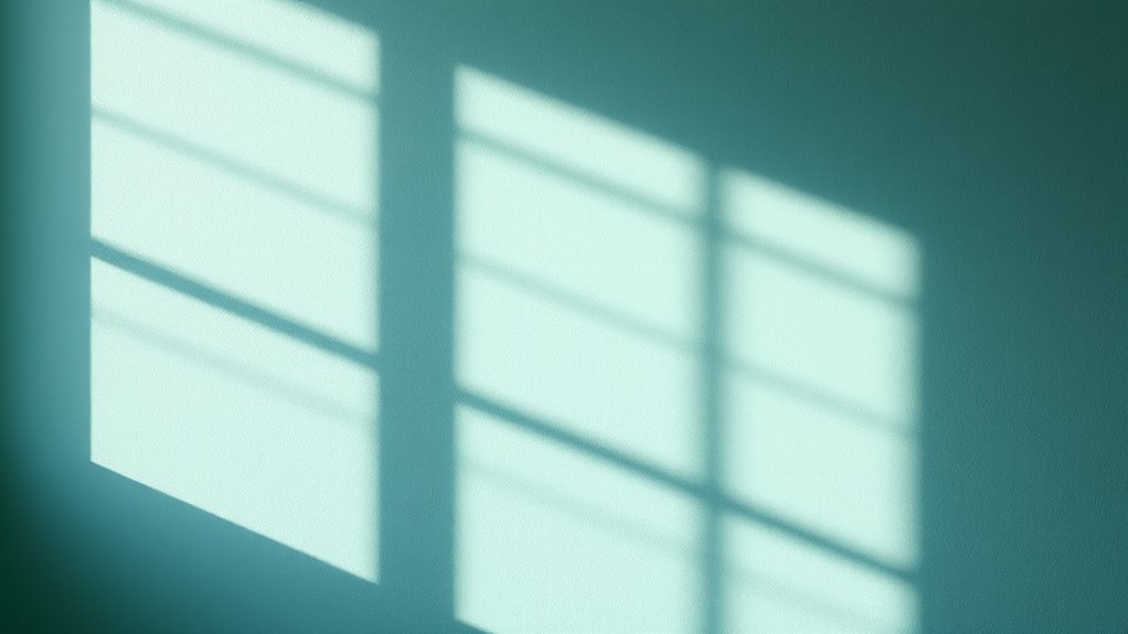
The Meaning of Blues and How They Shape Your Mood and Space
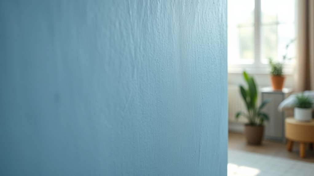
Blue shades naturally promote calmness and relaxation, helping you feel more at ease in any space. Lighter blues create a peaceful atmosphere that reduces stress, while darker tones foster stability and focus. By choosing the right blue, you can influence your mood and turn your environment into a tranquil retreat.
Calming and Relaxing Effects
Because lighter shades like sky blue and lavender are associated with calmness, incorporating these hues into your space can considerably reduce stress and promote relaxation. Blue shades have powerful psychological effects, fostering a sense of serenity and helping you achieve stress relief. These colors evoke feelings of openness, reminiscent of water and sky, which can positively influence your mood. Using blue in bedrooms and bathrooms enhances sleep quality by creating a peaceful, restful atmosphere. Cooler blue tones also support mental clarity and emotional stability, encouraging reflection and introspection. By choosing calming blue shades, you’re not just decorating; you’re intentionally shaping an environment that nurtures tranquility and helps you unwind. These hues truly make your space a sanctuary for relaxation and mental well-being.
Enhancing Room Tranquility
When selecting shades to create a tranquil environment, the psychological effects of blues play a crucial role in shaping your space and mood. Blue tones like navy and teal evoke calm, trust, and serenity, promoting relaxation. Light blue and lavender hues reduce stress, making them perfect for bedrooms and calming areas. Cooler blue tones make rooms feel more open and spacious, enhancing airiness and easing feelings of confinement. The psychological impact of blue also lowers heart rate and blood pressure, fostering a peaceful, meditative mood. Incorporating blue accents or walls can improve focus and mental clarity, supporting a serene yet productive atmosphere.
| Blue Shade | Effect on Mood | Ideal Space |
|---|---|---|
| Navy | Calm, trust | Living rooms |
| Light Blue | Relaxation, tranquility | Bedrooms |
| Teal | Serenity, focus | Home offices |
| Lavender | Stress reduction | Meditation rooms |
| Cooler Blue | Spaciousness, calm | Small rooms |
Influencing Emotional Responses
Colors have a powerful way of shaping your emotional responses and influencing how you feel in a space. Blues, in particular, evoke feelings of calmness and tranquility, which can reduce stress and promote relaxation. The psychology of shades of blue shows they can lower blood pressure and heart rate, fostering a sense of peace and mental clarity. Different shades evoke specific emotions: navy blue conveys professionalism and trust, while soft sky blue encourages openness and friendliness. Incorporating blue in your environment can enhance focus and concentration, making it ideal for work or study areas. However, overusing blue shades might lead to feelings of sadness or aloofness. Balancing with warm tones or neutrals helps create an inviting atmosphere that supports positive emotions and well-being.
Pinks and Soft Shades: Emotions and Personal Traits They Convey
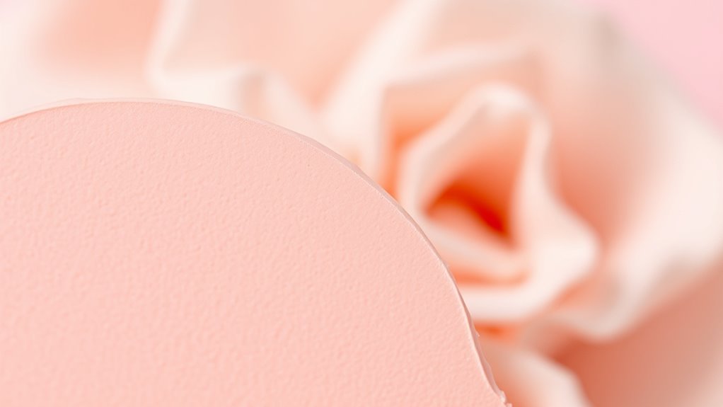
Pinks and soft shades like blush or magenta communicate a range of warm, positive emotions, often reflecting nurturing and joyful personalities. These hues evoke feelings of compassion, love, and happiness, making them ideal for creating inviting spaces in interior design. Light pinks, used as neutral tones, convey tenderness and approachability, while softer shades suggest creativity and playfulness. The shade intensity influences mood: brighter pinks energize, whereas softer tones promote calmness and serenity. Depending on the hue and context, pink can express innocence, confidence, or compassion.
| Color Shade | Personal Trait or Emotion | Interior Design Impact |
|---|---|---|
| Bright Pink | Energetic, confident | Adds vibrancy and enthusiasm |
| Soft Pink | Gentle, nurturing | Creates calm, welcoming atmospheres |
| Magenta | Playful, creative | Sparks imagination and zest |
Dark Colors and Their Subtle Messages About Your Style and Preferences

Dark colors like navy blue, charcoal, and deep green send a subtle yet powerful message about your style and personality. They reveal a sophisticated, confident vibe and a preference for elegance and depth. Choosing black or very dark shades often signals a desire for power, mystery, or a timeless, classic style. These paint shades subtly communicate that you value privacy, introspection, and a moody aesthetic that emphasizes mood over brightness. Using dark hues as accents shows a bold, daring attitude and a willingness to challenge traditional interior design norms. Your preference for dark shades often points to an appreciation for drama, luxury, and creating intimate, cocooning spaces. Overall, dark colors speak volumes about your refined taste and unique style preferences.
How Color Choices Influence Your Environment and Emotional Well-Being
The hues you choose for your environment can profoundly shape your emotional state and overall well-being. This is where color psychology comes into play, revealing how different shades influence your mood and psychological effects. Warm tones, like reds and oranges, energize you, while cool tones, such as blues and greens, promote relaxation and reduce stress. In interior design, these choices can enhance mood influence, helping create spaces that support your mental health. Your personal preferences for certain shades often reflect underlying emotional states and personality traits, impacting social interactions and overall harmony. By understanding the hidden meanings behind your favorite paint shades, you can intentionally craft environments that foster emotional well-being and personal balance, making your space not only beautiful but also emotionally nourishing.
Frequently Asked Questions
What Do the Colors of Paint Mean?
When you ask what paint colors mean, you’re exploring how they influence your mood and perceptions. For example, red sparks energy and passion, while blue brings calmness and trust. Colors also carry cultural symbolism—white can mean purity or mourning. By understanding these hidden meanings, you can choose shades that reflect your personality and create the emotional atmosphere you desire in your space.
What Does Purple Mean in a Bedroom?
Imagine stepping into your bedroom as if entering a palace of serenity. Purple in your space whispers luxury, creativity, and spiritual depth, wrapping you in calm and inspiration. Lighter shades like lavender soothe you into restful sleep, while deep purples add richness and elegance. This color invites introspection and wisdom, helping you reflect and grow. Used thoughtfully, purple transforms your bedroom into a sanctuary of both relaxation and personal enlightenment.
What Does Painting a Room Blue Mean?
When you paint a room blue, you’re creating a space that fosters calm, tranquility, and emotional stability. Lighter shades help you relax and build trust, while darker tones convey professionalism and authority. Blue also lowers your blood pressure and heart rate, making it perfect for restful areas like bedrooms or meditation rooms. However, too much blue might bring feelings of sadness, so balancing it with warmer colors helps keep the space inviting and harmonious.
What Does “White in the Bedroom” Mean?
When you choose white for your bedroom, it often shows you value peace, purity, and a calming space for rest. You likely prefer a bright, open environment that reflects light and feels spacious. White also acts as a neutral backdrop, highlighting your personal touches. It suggests you enjoy cleanliness, simplicity, and a clutter-free vibe, creating a serene atmosphere where you can relax and start fresh each day.
Conclusion
Remember, your favorite paint shade isn’t just about style—it’s a window into your soul. As the saying goes, “You are what you wear,” or in this case, what you paint your space with. Your color choices reveal your personality, mood, and even your inner thoughts. So next time you pick a hue, trust your instincts; it’s your personal story told in shades, shaping your environment and reflecting who you truly are.