
To make a room look bigger, start by using light, neutral colors on walls and furniture to reflect more light. Opt for monochromatic schemes with subtle variations in shades to create a seamless flow. Incorporate soft pastels or lighter shades for an airy feel and highlight walls with brighter tones. Add vertical or horizontal stripes to elongate or widen spaces, and use transparent decor to keep sightlines open. Proper lighting enhances these effects, so keep exploring for more ideas.
Key Takeaways
- Use light, neutral, and pastel colors to reflect light and create an airy, spacious feel.
- Highlight walls with lighter shades to enhance brightness and depth perception.
- Incorporate monochromatic color schemes with varying shades of a single color for seamless flow.
- Opt for reflective hues like whites and pastels to maximize natural and artificial light.
- Balance color with proper lighting to reduce shadows and enhance the perception of space.
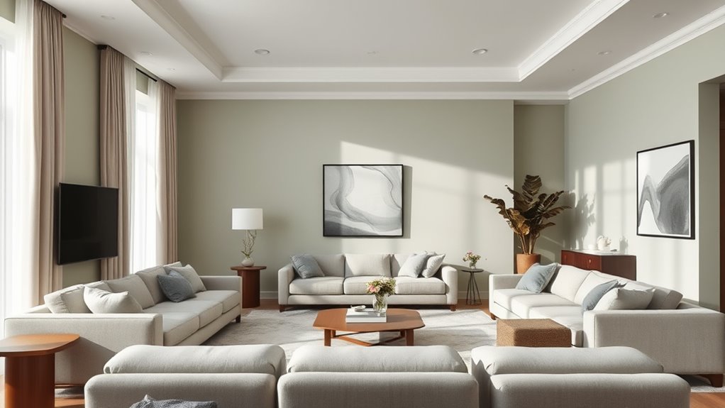
Embrace Light and Neutral Colors
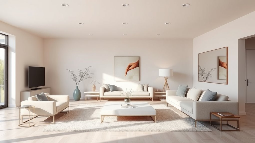
Using light and neutral colors is one of the simplest ways to make a room feel more spacious. Opt for shades like soft whites, beiges, or pastels to reflect more light and create an airy atmosphere. To add visual interest, consider a bold accent wall in a neutral hue that contrasts with your other walls, which draws the eye without overwhelming the space. Incorporate contrasting trim in a slightly darker or lighter shade to highlight architectural details and add depth. These choices help maintain a cohesive, open feel while adding subtle accents that keep the room engaging. The key is to keep the color palette simple and light, making the space appear larger and more inviting effortlessly. Additionally, selecting furniture and decor with unique and wicked planters can enhance the aesthetic without cluttering the space.
Use Monochromatic Color Schemes

A monochromatic color scheme, which involves decorating with varying shades of a single color, can make a room feel more spacious and cohesive. By focusing on monochromatic harmony, you create a seamless flow that tricks the eye into perceiving more space. Using different tones within one hue adds depth without clutter, enhancing the sense of openness. This approach emphasizes single tone elegance, making your room feel sophisticated yet uncluttered. Stick to lighter shades to maximize the illusion of space, while darker accents can add contrast and interest without overwhelming the room. When done thoughtfully, a monochromatic palette simplifies the visual complexity, helping your space look bigger and more unified. Incorporating emotional support strategies can also create a more comfortable and inviting environment. It’s an effective, stylish trick that transforms your room into a more open, inviting area.
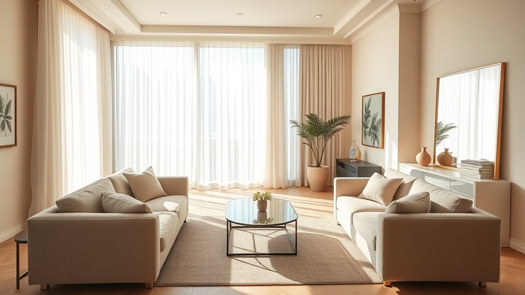
Incorporate Soft Pastels for a Subtle Expansion
Soft pastels can gently open up a room by adding subtle color without overwhelming the space. Incorporate pastel accents to introduce a touch of color while maintaining a light, airy feel. These soft shades create subtle shading that visually expands the room, making it appear larger and more inviting. Choose colors like blush pink, mint green, or powder blue to keep the atmosphere calm and open. Using pastels on walls, decor, or furniture helps reflect more light and prevents the space from feeling cramped. Keep the palette simple to avoid cluttering the visual field. This approach creates a delicate balance, giving your room a fresh, spacious look without sacrificing style or comfort. Soft pastels are the perfect trick for a subtle, yet effective, room expansion. Additionally, incorporating differing pastel shades can add dimension and depth, further enhancing the sense of space.
Opt for Matte Finishes to Reduce Reflection
Choosing matte finishes for your walls and furniture can substantially reduce unwanted reflections, helping your room feel more open and spacious. Glossy surfaces tend to bounce light around, creating glare and visual clutter that can make a space feel smaller. Matte finishes absorb light rather than reflect it, which minimizes reflection and creates a softer, more uniform look. This reflection reduction allows the eye to focus on the room’s shape and color, rather than distracting shine. By opting for matte paints and finishes, you enhance the sense of depth and openness in your space. Plus, matte surfaces tend to hide fingerprints and imperfections better, maintaining a clean, sleek appearance. Incorporating attention into your design process can help you become more mindful of how light and surface finishes influence spatial perception. Overall, matte finishes are an effective, subtle trick to make your rooms feel larger and more inviting.
Highlight Walls With Lighter Shades

Using lighter shades on your highlight wall can make a small room feel brighter and more open. These colors reflect more light, creating an inviting atmosphere. Plus, they add depth, making your space appear larger than it actually is. Incorporating color psychology principles can enhance the perceived size and comfort of the room.
Brightens Small Spaces
Have you ever noticed how lighter-colored walls can instantly make a room feel more open and airy? This is a key trick in brightening small spaces. Using color psychology, lighter shades like soft whites, pastels, or warm neutrals reflect more light, making the room appear larger. To maximize this effect, consider:
- Painting accent walls in a gentle hue to draw the eye outward.
- Choosing furniture in light tones to blend seamlessly and avoid overwhelming the space.
- Placing mirrors opposite windows to reflect the natural light.
- Arranging furniture away from walls to create a sense of openness and flow.
- Incorporating natural light through window treatments and strategic placement can further amplify the effect of lighter wall colors.
These strategies work together to enhance light and space, transforming your room into a brighter, more inviting area.
Enhances Room Depth
To create a sense of depth in your room, highlight walls with lighter shades. Using lighter colors on one wall creates a subtle color contrast that draws the eye inward, enhancing the feeling of space. This technique leverages visual illusions, making the room appear larger and more expansive. By choosing a shade slightly lighter than the surrounding walls, you create a layered effect that adds dimension without clutter. The contrast between the light highlighted wall and the darker adjacent walls emphasizes depth, making your room feel more dynamic. Keep in mind that consistent lighting will maximize this effect. Additionally, incorporating visual perception principles can further enhance the illusion of spaciousness. Overall, strategic use of lighter shades on accent walls is an effective way to manipulate perception and give your room a more spacious, open feel.
Add Depth With Accent Walls in Darker Tones
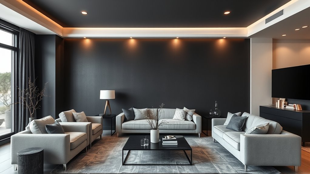
Darker accent walls can dramatically add depth to a room by creating a sense of dimension and coziness. To achieve this, consider using bold wall murals or textured wallpapers in deep hues like navy, charcoal, or forest green. These choices draw the eye inward, making the space feel larger yet more intimate. Imagine:
- A rich, velvety navy wall behind your sofa, adding a sense of enclosure.
- A textured charcoal wallpaper that creates subtle shadows and layers.
- An intricate wall mural with dark tones that adds visual interest without overwhelming.
- A matte black accent wall that absorbs light, giving the illusion of a deeper room.
Additionally, incorporating visual balance through strategic placement of lighting and decor enhances the overall depth effect.
Utilize Vertical and Horizontal Stripes
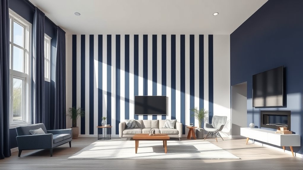
Using vertical stripes on your walls can make ceilings appear taller, giving your room more height. Horizontal stripes, on the other hand, can create a sense of expanded space by drawing the eye outward. Keeping a consistent color pattern across stripes enhances the room’s unity and amplifies the visual effect. Incorporating design principles such as stripe orientation can further optimize the perception of space in small rooms.
Vertical Stripes Add Height
Vertical stripes are one of the most effective ways to make a room feel taller. They draw the eye upward, creating the illusion of increased wall height and enhancing ceiling illusions. To maximize this effect, consider these options:
- Use narrow, evenly spaced vertical stripes to elongate the walls.
- Choose contrasting colors that emphasize the stripes’ vertical direction.
- Paint stripes from floor to ceiling for seamless height extension.
- Incorporate vertical striped wallpaper on feature walls to add visual height without overwhelming the space.
- Pair vertical stripes with color contrast strategies to further enhance the perception of height.
Horizontal Stripes Expand Space
While vertical stripes can make a room feel taller, horizontal stripes are your go-to choice for creating a sense of expanded space. They draw the eye outward, making walls appear longer and rooms wider. To enhance this effect, hang wall-mounted art along the stripes—positioned to emphasize the horizontal lines. Incorporate large area rugs with horizontal patterns to reinforce the illusion of breadth. Here’s a visual to imagine:
| Wall Pattern | Accent Items | Floor Decor |
|---|---|---|
| Wide horizontal stripes | Wall-mounted art across the stripe | Large, horizontally patterned area rug |
| Light color stripes | Low-profile furniture | Extending the pattern with rugs |
| Bold stripe contrast | Minimalist accessories | Rug placement to widen the space |
| Subtle stripe variation | Horizontal shelving | Rugs that stretch across the room |
| Continuous stripe flow | Mirrors aligned with stripes | Rugs that complement wall pattern |
Consistent Color Patterns
To create a cohesive and spacious look, adopting consistent color patterns with vertical and horizontal stripes can substantially enhance your room’s sense of openness. Use bold accent walls painted in a solid, contrasting color to draw the eye and add depth. Incorporate contrasting trims around windows and doors to define spaces clearly. Consider applying vertical stripes on one wall to elongate the room’s height, creating a sense of grandeur. Alternatively, horizontal stripes across the walls can make the space feel wider. To keep the pattern unified, choose a limited color palette and repeat it throughout. This consistency prevents visual clutter, making the room feel more open and airy. When done right, bold accent walls and contrasting trims reinforce your pattern and amplify the illusion of space.
Choose Colors That Reflect Light Effectively
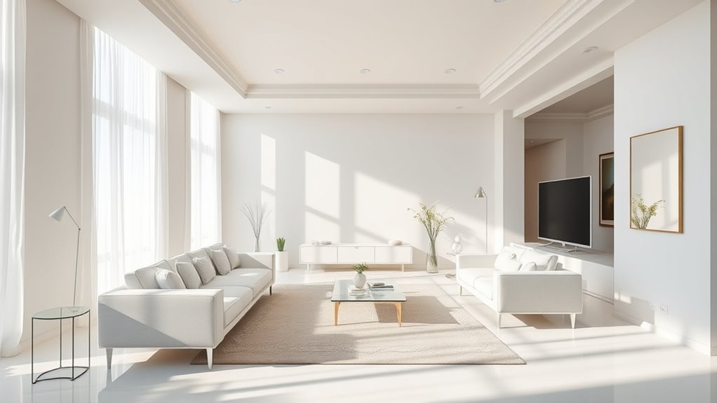
Choosing colors that reflect light effectively can dramatically make a room feel larger. Light-reflective hues bounce more light around the space, enhancing brightness and openness. When selecting paint or decor, consider using lighter shades like whites, creams, or pastels, which maximize natural and artificial lighting. Incorporating effective lighting techniques, such as strategically placed lamps and fixtures, amplifies this effect. Color psychology also plays a role; softer, cool colors tend to feel more expansive and calming. Avoid dark, matte tones that absorb light and make a room seem smaller. By choosing the right reflective colors and optimizing your lighting setup, you can create an illusion of greater space, making your room feel airy, open, and inviting.
Incorporate Transparent and Translucent Decor
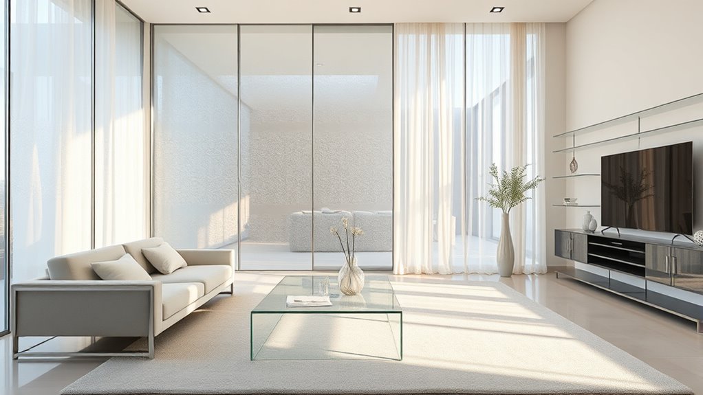
Incorporating transparent and translucent decor items can instantly make your space feel more open and airy. Using transparent decor, like glass vases or acrylic side tables, creates visual flow and reduces clutter. Translucent furniture, such as frosted glass cabinets or acrylic chairs, allows light to pass through, enhancing the sense of space. Imagine these options:
Transparent and translucent decor instantly open up your space, adding light, flow, and a clutter-free look.
- A glass coffee table that reflects light and blends seamlessly into the room.
- Clear acrylic shelves that display your belongings without crowding the space.
- Translucent lampshades that softly diffuse light, brightening the room.
- Transparent room dividers that separate areas while maintaining openness.
These items improve sightlines and prevent visual blockages, making your room seem larger and more inviting.
Balance Colors With Proper Lighting

Balancing colors with proper lighting is essential for creating a sense of spaciousness in a room. Lighting harmony enhances your chosen colors, making them appear more vibrant and cohesive. Use natural light to highlight soft, neutral tones, which reflect light and expand the space visually. Artificial lighting, such as warm or cool LEDs, can influence color psychology, affecting how spacious a room feels. Bright, well-placed lights reduce shadows and eliminate dark corners, contributing to an open atmosphere. Avoid harsh, uneven lighting that can distort colors and make a room feel smaller. By carefully coordinating your lighting with your color palette, you create a balanced environment that maximizes the perception of space and enhances the room’s overall feel.
Frequently Asked Questions
How Do Color Choices Influence the Perceived Height of a Room?
Color choices greatly influence how tall a room feels. Using color contrast between walls and ceiling can draw the eye upward, making the space seem taller. Incorporating wall accents in a different shade adds depth and interest, emphasizing height. Light, neutral colors on walls create an airy feel, while darker shades can make a space feel more cozy and grounded. Strategic use of contrasting colors and wall accents helps you manipulate perceived room height.
Can Color Psychology Impact a Room’S Spaciousness?
Imagine your space as a canvas for emotional impact—color psychology definitely plays a role in how spacious it feels. Light, cool tones with a balanced color temperature tend to open up a room, making it seem larger. Warm hues might cozy it up, but too much warmth can shrink the sense of space. So, choosing colors carefully influences not just mood but also the room’s perceived size through emotional impact.
Are There Specific Color Combinations That Visually Expand Small Spaces?
You can make small spaces look bigger by using monochromatic schemes, which keep colors consistent and create a seamless flow. Adding contrasting accents, like pillows or artwork, draws attention without cluttering the room. These combinations make the space feel open and airy. By balancing harmony with strategic pops of contrast, you enhance the room’s sense of size and prevent it from feeling cramped or busy.
How Does Natural Versus Artificial Lighting Affect Color Perception?
Natural light and artificial lighting both influence how colors appear in your space. Natural light, which changes throughout the day, tends to make colors look more vibrant and true to life, helping your room feel more open. Artificial lighting can sometimes alter colors, making them look warmer or cooler depending on the bulbs used. To maximize room size, balance natural and artificial lighting to keep colors consistent and bright.
What Are Common Mistakes to Avoid When Using Color to Enlarge a Room?
You don’t want your room to look like a rainbow exploded—avoid color clashing and overuse of bold hues that can overwhelm the space. Stick to a cohesive palette and use lighter shades to create an illusion of openness. Don’t forget, too many contrasting colors or overly vibrant accents can shrink your room visually. Keep it simple and balanced, and your space will feel bigger without sacrificing style.
Conclusion
By masterfully applying these color tricks, you can transform your space into a breath of fresh air, where every corner feels open and inviting. Think of your room as a canvas — with the right colors, you’re painting a brighter, more expansive future. Embrace light hues, strategic contrasts, and clever lighting to make your space feel larger than life. With these tips, you hold the palette to turn your room into a spacious sanctuary you’ll love.