
Jewel tones are becoming the next big thing in interior design because of their timeless elegance and versatile appeal. Rich hues like emerald, sapphire, and ruby add depth, luxury, and emotional impact to your space. They work well with both modern and vintage styles, pairing beautifully with neutrals and textures. Their popularity is only growing, making them a smart choice for creating stylish, sophisticated interiors. Keep exploring to see how you can incorporate these vibrant colors into your home.
Key Takeaways
- Jewel tones evoke timeless luxury and sophistication, making them versatile choices that remain stylish across different design trends.
- They add depth and visual interest, creating vibrant focal points in interiors with rich, layered textures.
- Their compatibility with neutral palettes and natural materials allows for seamless integration into diverse aesthetic styles.
- Jewel tones enhance vintage-inspired designs, blending antique charm with modern elegance for a layered, timeless look.
- Industry forecasts confirm their long-term relevance due to their adaptability, emotional impact, and ability to elevate interior spaces.
The Growing Popularity of Jewel Tones in 2025
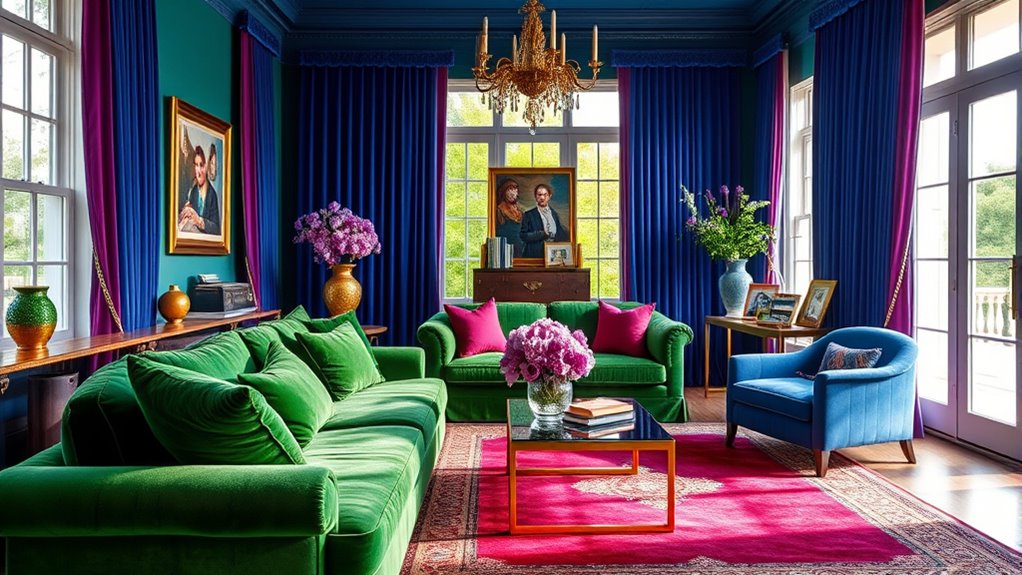
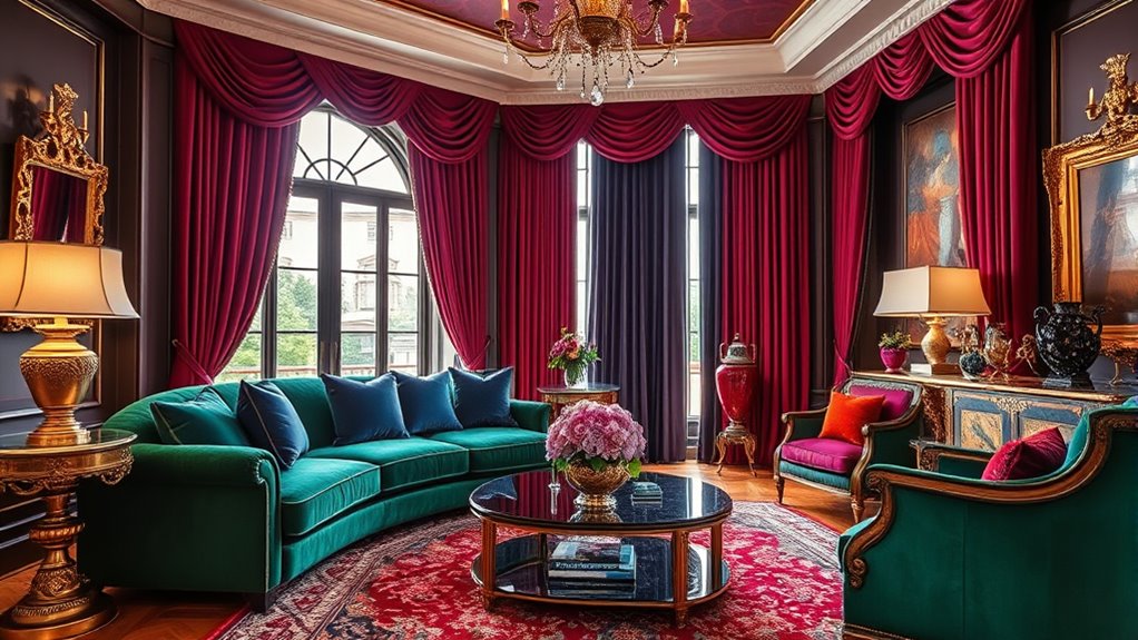
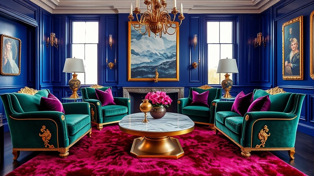
As 2025 unfolds, jewel tones are taking center stage in interior design, with experts predicting they’ll dominate the trends this year. These deep, rich hues like emerald, sapphire, and ruby are becoming essential for creating vibrant, luxurious spaces. The trend reflects a resurgence of vintage and antique aesthetics, with jewel tones perfectly complementing historical furniture and finishes. Major design publications, such as Elle Decor, highlight jewel tones as key elements for adding sophistication and boldness to interiors. You’ll see these colors used both boldly—through large furniture pieces—and subtly—in accents and accessories. The strategic use of lighting and textures further enhances their richness, making jewel tones a versatile and compelling choice for transforming your interior design into a stunning, contemporary space. Incorporating color psychology and AI-driven color analysis into your design process can help you select and balance these striking colors effectively.
How Jewel Tones Enhance Interior Design Aesthetics
Jewel tones elevate interior design by adding depth, richness, and visual interest that immediately draw the eye. These colors evoke powerful emotional responses, from moody elegance to vibrant energy, transforming a space’s mood. Incorporating jewel tones through furniture, walls, or accessories creates focal points that enhance your design’s appeal. When paired with neutral or earthy tones, jewel colors balance boldness with warmth, producing a sophisticated ambiance. Strategic lighting further amplifies their luminous qualities, making these hues stand out even more. To understand their impact, consider this table:
| Element | Effect of Jewel Tones | Complementary Tones |
|---|---|---|
| Walls | Add richness and depth | Neutrals for balance |
| Furniture | Creates focal points | Earth tones for warmth |
| Accessories | Elevate visual interest | Soft shades for harmony |
This interplay enhances your interior design’s aesthetic.
Versatility: Incorporating Jewel Tones Into Various Styles
Jewel tones work beautifully across different interior styles, from sleek modern spaces to eclectic vintage rooms. You can use them as bold focal points or subtle accents, making them highly adaptable. Pairing these rich hues with neutral colors creates a sophisticated look that fits any decor theme. Additionally, incorporating diverse designs such as quirky shapes and colors can further enhance the visual interest and personalization of your space.
Complements Multiple Aesthetics
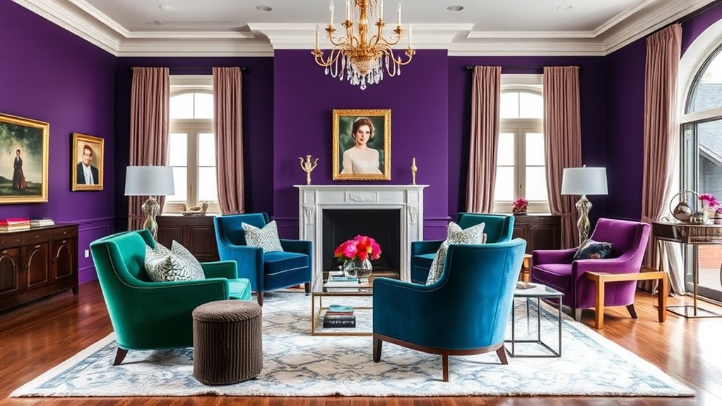
Their vibrant hues effortlessly adapt to a variety of interior styles, making them a versatile choice for any space. Jewel tones in interior design can seamlessly complement everything from classic and traditional to modern and eclectic aesthetics. When paired with neutral palettes like beige, taupe, or white, these rich colors create a sophisticated contrast that elevates the overall look. Incorporating jewel tones into furniture, decor, or accent walls allows you to easily switch between different design themes without overwhelming the space. Their depth and intensity can elevate minimalist interiors or add personality to maximalist or vintage-inspired rooms. Because jewel tones blend well with both warm and cool color schemes, they provide endless flexibility to achieve your desired aesthetic, no matter your style preferences. Additionally, understanding how to change gears smoothly on a gravel bike can help maintain a steady rhythm and prevent unnecessary wear, much like blending jewel tones seamlessly integrates into various design themes. Recognizing the support hours of entertainment venues can ensure you plan your visits during optimal times to enjoy these vibrant color schemes in action. Moreover, selecting the right lighting conditions can enhance the richness and vibrancy of jewel tones, making them stand out even more in your interior. Being aware of the optimal tire pressure for gravel can also inspire color choices in your decor, as the boldness of jewel tones can mimic the vibrant energy of well-inflated tires.
Easily Paired With Neutrals
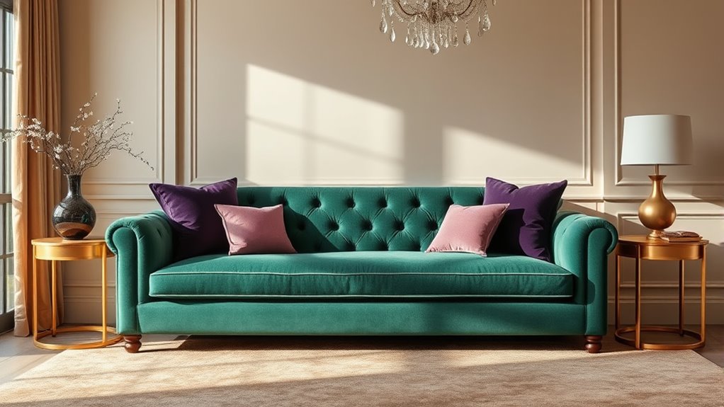
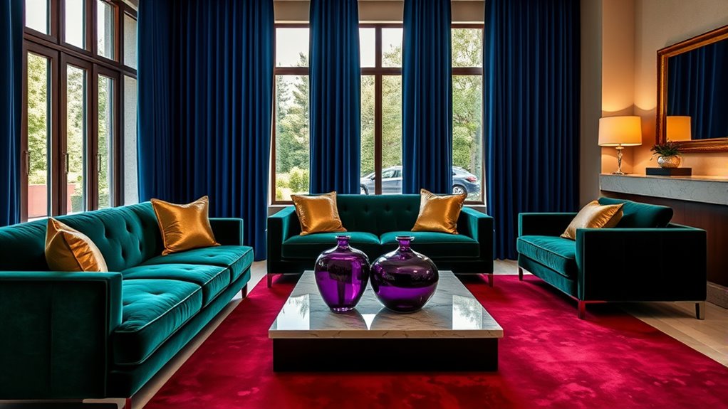
Because of their rich, vibrant hues, jewel tones effortlessly pair with neutral palettes like beige, taupe, and ivory to create a balanced and sophisticated look. This versatility allows you to incorporate jewel tones into various styles, from sleek modern to timeless classic. Adding jewel tones as accent pieces—such as cushions, artwork, or cabinetry—against neutrals creates vibrant focal points without overwhelming the space. You can also mix rich jewel hues with soft neutrals in textiles and decor for a harmonious contrast that adds depth and visual interest. This pairing not only elevates your interior but also guarantees your design remains flexible and stylish over time.
- Creates a balanced, sophisticated atmosphere
- Works across multiple design styles
- Easy to update with changing trends
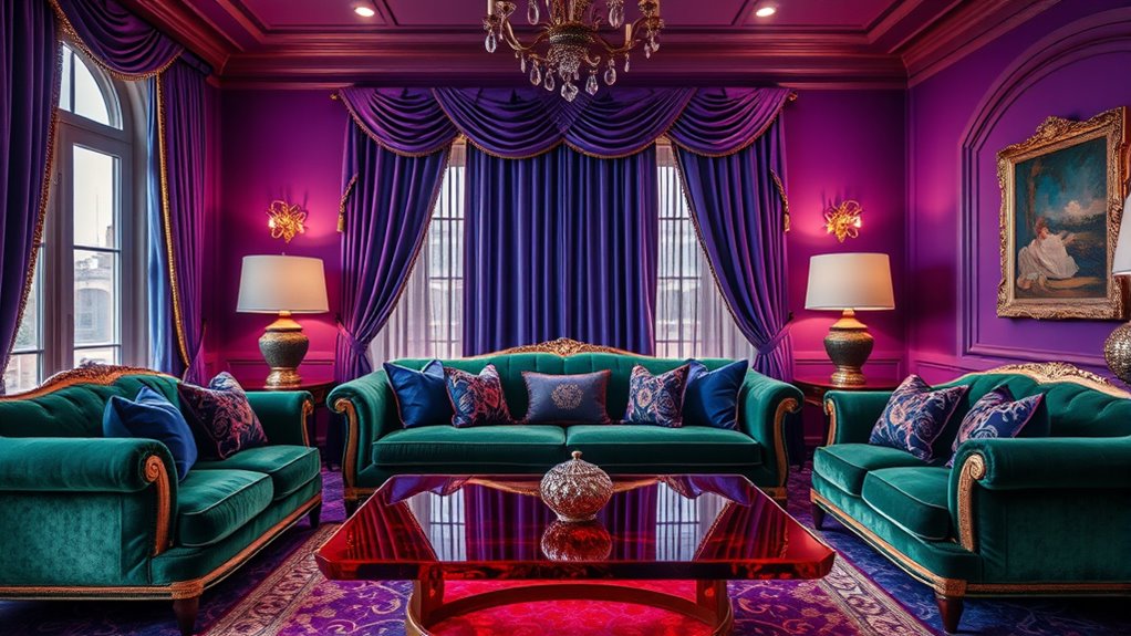
The Impact of Lighting and Texture on Jewel Tones
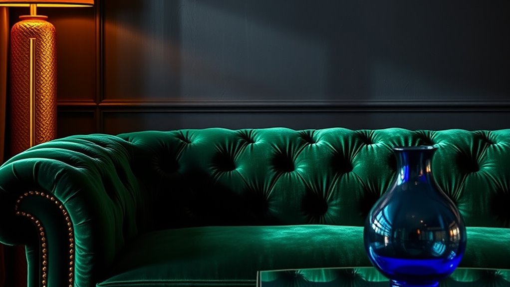
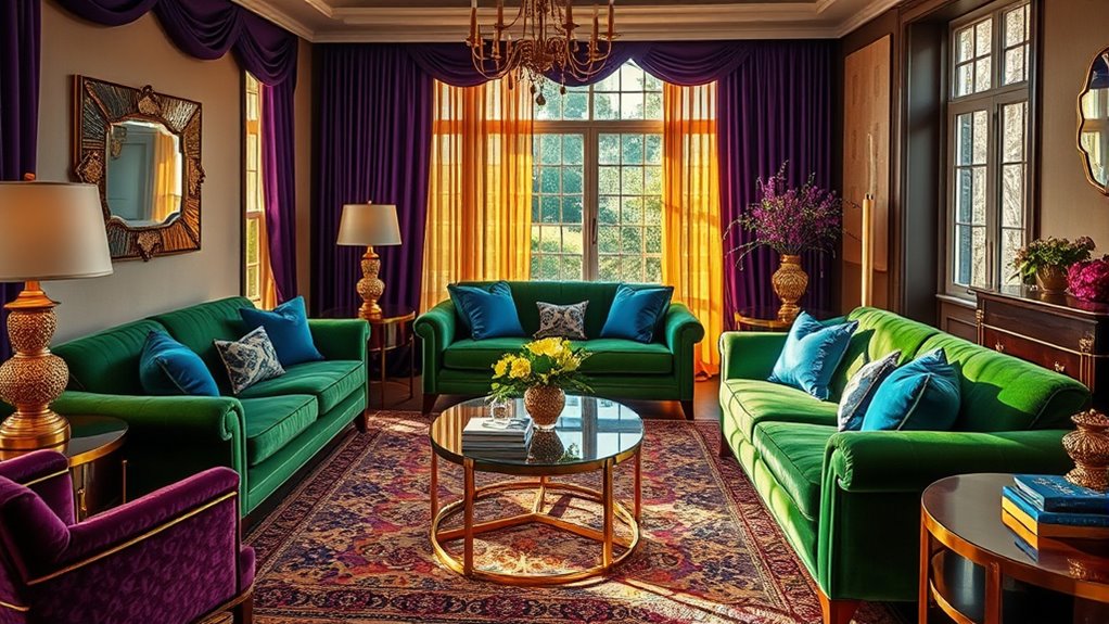
Lighting plays an essential role in bringing out the full richness of jewel tones, as layered ambient, task, and accent lights work together to highlight their vibrancy and set the mood. Proper lighting enhances depth and makes colors pop, whether you prefer warm, soft glow for coziness or cool, direct light for boldness. Understanding the effects of different light temperatures can help you choose the right ambiance for your space. Incorporating lighting techniques that emphasize color can further elevate your interior’s aesthetic. Thoughtful placement of light sources can also create visual contrast, adding dimension to the hues. Additionally, considering lighting layers ensures that each aspect of the room’s illumination contributes to showcasing jewel tones effectively. Texture also influences how jewel tones appear; materials like velvet, silk, or leather reflect light differently, adding dimension and complexity. Reflective surfaces such as mirrors and metallic finishes amplify luminosity, making jewel tones more striking. The interplay of lighting and texture allows you to create either a moody, intimate atmosphere or a vibrant, energetic space. Additionally, understanding the relationships between lighting, texture, and color can help you craft a cohesive and inviting environment. Mastering these elements helps you elevate jewel tones, making your interiors truly mesmerizing.
Combining Jewel Tones With Neutral Palettes for Balance
Combining jewel tones with neutral palettes creates a harmonious balance that showcases vibrant colors without overwhelming the space. Earthy neutrals like beiges, taupes, and sandy shades serve as versatile backdrops, allowing jewel tones to shine. Use neutral walls and large furniture pieces to let jewel-toned accents such as cushions, rugs, or artwork become focal points. Pairing deep jewel hues with soft neutrals in textured fabrics like velvet, linen, or stone adds depth and sophistication. Incorporating layered textures and subtle color variations can further enhance the cozy, inviting atmosphere. This strategic blend aligns with 2025 trends, offering a timeless yet modern look that balances comfort and elegance. Incorporating local design preferences can further enhance the harmony between bold jewel tones and neutral shades. Paying attention to color psychology can help create environments that evoke specific moods and feelings, enhancing the overall design impact. Additionally, understanding interior color harmony can guide the seamless integration of these tones for a cohesive aesthetic. Moreover, considering furniture placement can optimize the visual flow and balance within the space.
Notable Residential Spaces Featuring Jewel Tones
Many modern residential spaces showcase the striking appeal of jewel tones, transforming interiors into vibrant retreats. The ONE11 Residences at Thompson Central Park use rich orange and deep purple accents, creating a luxurious, contemporary glam look. Tribeca Green’s Residence 14HI features jewel-toned wallpaper in blues and greens, emphasizing boldness and sophistication while complementing park views. The Selene studio by FrenchCALIFORNIA highlights an ombre jewel-toned accent wall in the living room, enhancing natural light and luminous ambiance. Incorporating color psychology can help homeowners select jewel tones that evoke desired emotions and atmospheres within their spaces. Additionally, understanding individual emotional responses to colors can guide the selection process to create more personalized and harmonious interiors. 77 Greenwich and 53 West 53 incorporate deep greens and burnt oranges into their interior palettes, aligning bold colors with city and water views. Meanwhile, the Scandinavian-inspired condo at 547 West 47th Street employs jewel-toned chairs and berry-hued carpets, creating a cozy yet elegant interior.
The Connection Between Vintage Inspiration and Jewel Tones
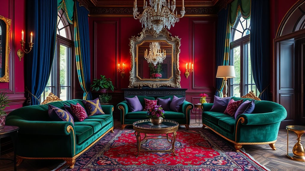
Vintage inspiration has made a strong comeback, and jewel tones perfectly capture its rich, luxurious feel. These deep colors blend antique charm with modern design, creating a layered, timeless look. By incorporating jewel tones, you can fuse old-world elegance with contemporary style effortlessly.
Vintage Aesthetic Revival
The vintage aesthetic revival in interior design has gained momentum as homeowners seek to create spaces that feel both nostalgic and timeless. This movement is closely tied to the popularity of jewel tones, which evoke a sense of history and elegance. You’ll notice how jewel tones like emerald, ruby, and sapphire complement antique furniture and vintage-inspired decor, enriching the overall ambiance. This trend draws inspiration from the art deco era, where deep, gem-like colors dominated architecture, textiles, and furnishings. Using jewel tones with vintage elements enhances authenticity and character, blending old-world charm with modern style. To deepen the vintage aesthetic, consider:
- Incorporating rich, jewel-toned textiles
- Restoring antique furniture with vibrant accents
- Using jewel hues as focal points in decor
Rich Color Palettes
Rich color palettes rooted in jewel tones serve as a natural extension of vintage-inspired interior design, enhancing the sense of opulence and history. These jewel tones—emerald, ruby, sapphire, and amethyst—bring depth and vibrancy, echoing the grandeur of vintage and antique decor. They align seamlessly with the Art Deco revival, emphasizing bold patterns, luxurious materials, and glamorous silhouettes inspired by early 20th-century style. When you incorporate rich color palettes with jewel tones, you evoke nostalgia while creating a timeless, layered aesthetic. Pairing these deep hues with antique finishes, brass accents, and textured fabrics amplifies their luxurious appeal. This approach not only highlights the historical significance of jewel tones but also elevates modern interiors with a sophisticated, vintage-inspired charm.
Antique and Modern Fusion
Blending antique pieces with jewel tones creates a striking fusion of old-world charm and contemporary elegance. This combination elevates your space by highlighting vintage-inspired furniture or antique accessories with rich, saturated hues like emerald or ruby. These jewel tones enhance the craftsmanship of antique woods, metals, and textured fabrics, making them stand out. The resurgence of styles like Art Deco and mid-century modern often incorporates jewel tones, seamlessly blending historical influences with modern design. To achieve this look, consider adding:
- Vintage-inspired furniture with jewel-toned upholstery
- Antique accessories highlighted by bold, deep hues
- Modern decor that contrasts jewel tones with antique elements
This approach bridges the gap between antique and modern, creating a cohesive, luxurious aesthetic that’s both timeless and current.
Practical Tips for Using Jewel Tones at Home
To incorporate jewel tones effectively, start small with accent pieces like cushions, vases, or artwork that add vibrant color without overwhelming your space. These jewel-tone accent pieces create focal points and introduce rich hues effortlessly. Once comfortable, consider larger furniture, such as a velvet emerald sofa or sapphire armchair, to make a bold statement. Pair jewel tones with neutral or earthy hues like beige, taupe, or sandy tones to keep the look balanced and sophisticated. Layer textures, like velvet, silk, or antique rugs, to add depth and richness to your decor. Strategic lighting, such as warm ambient or accent lights, enhances jewel tones’ vibrancy and mood. These practical tips help you incorporate jewel tones seamlessly into your home for a stylish, cohesive look.
Future Trends: Why Jewel Tones Will Remain Timeless
Jewel tones have proven their versatility in home decor, and their popularity is only expected to grow through 2025 and beyond. These rich, deep hues like emerald, sapphire, and ruby evoke luxury and sophistication that stay relevant despite shifting design trends. Their timeless appeal ensures you can incorporate jewel tones into any style, from sleek modern to vintage-inspired spaces. Mixing jewel tones with natural textures and neutral backgrounds creates a balanced aesthetic that endures over time. Industry experts forecast that jewel tones will remain a classic choice, thanks to their adaptability and enduring charm. As you plan your interior updates, remember that jewel tones will continue to elevate your space, offering both style and timeless elegance for years to come.
- Versatility across design styles
- Ability to blend with natural textures
- Enduring appeal despite changing trends
Frequently Asked Questions
Why Do I Look Better in Jewel Tones?
You’re likely to look better in jewel tones because these rich, bold colors enhance your natural complexion. They create a striking contrast that makes your features stand out, especially if you have warmer or cooler undertones. Wearing jewel tones can also boost your confidence, as they’re associated with luxury and elegance. Overall, these colors highlight your best features and give you a luminous, radiant appearance.
What Is the 3 Color Rule in Interior Design?
The 3 Color Rule in interior design guides you to use three main colors for a balanced look. You choose a dominant color, a secondary hue, and an accent to add interest without chaos. This approach helps you avoid clutter and creates harmony. Typically, you pair a neutral with two vibrant or contrasting tones, giving your space depth and personality while maintaining visual cohesion.
Are Jewel Tones in for 2025?
You might be wondering if jewel tones are in for 2025. The answer is yes! Experts predict these deep, rich hues like emerald, sapphire, and ruby will dominate color palettes next year. You’ll see them used boldly or as subtle accents, adding luxury and personality to your space. Incorporating jewel tones now helps you stay ahead of trends and creates vibrant, layered interiors that evoke moodiness and style.
What Do Jewel Tones Symbolize?
Jewel tones symbolize luxury, richness, and timeless elegance. When you incorporate these deep, saturated colors into your space, you evoke feelings of opulence and heritage. They also represent bold self-expression, making your environment vibrant and personalized. Historically linked to wealth and status, jewel tones today suggest confidence, warmth, and sophistication. By choosing these hues, you create an interior that feels both dramatic and inviting, reflecting your unique style and taste.
Conclusion
Just like a timeless song that stays with you, jewel tones will continue to elevate your space long after trends fade. Embrace their rich, vibrant hues and let them transform your home into a personal masterpiece—your own modern treasure chest. As you incorporate these colors, remember that, much like a treasured heirloom, they hold the power to evoke joy, warmth, and a sense of timeless elegance in every corner of your life.