
To create stunning illusions in your home décor, use color tricks like gradients to add depth, making spaces feel larger and inviting. Incorporate contrast to make features pop, energizing the room and guiding the eye. Opt for monochromatic schemes to enhance a seamless, expansive look. Try color blocking to define zones or enlarge areas, and add reflective or glossy finishes that bounce light and add vibrancy. Keep exploring these techniques to transform your space effortlessly.
Key Takeaways
- Color gradients add depth and dimension, creating illusions of space and enhancing mood in rooms.
- High contrast color combinations make features pop and guide visual focus through bold boundaries.
- Monochrome palettes create seamless, expansive environments, tricking the eye into perceiving larger space.
- Color blocking defines zones and emphasizes architectural details, manipulating spatial perception.
- Reflective and glossy finishes bounce light, making small areas appear larger and more vibrant.
Using Color Gradients to Create Depth and Dimension

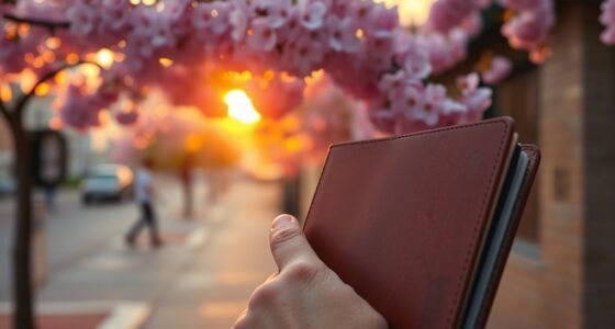
Color gradients are a powerful way to add depth and dimension to your home décor. They subtly shift between shades, creating visual interest that draws the eye inward or outward. This technique taps into the psychological effects of color, influencing mood and perception—cooler tones can make a space feel calmer, while warmer gradients evoke coziness. Additionally, color gradients often carry cultural symbolism, where specific hues symbolize traditions or beliefs, adding layers of meaning to your décor. By blending colors thoughtfully, you can manipulate a room’s atmosphere and perception of space. Whether you want to make a small room appear larger or add a sense of movement, gradients serve as an effective, versatile tool in your design arsenal. Incorporating color gradients into a farmhouse bedroom can enhance its rustic charm by highlighting textures and creating a cozy, inviting ambiance.
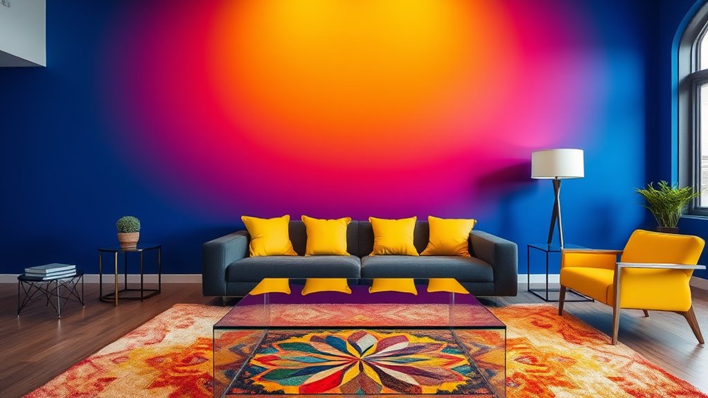
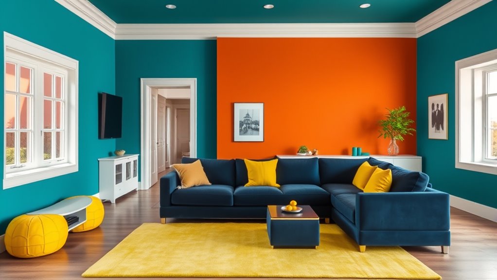
The Power of Contrast: Making Spaces Pop
Contrast is a dynamic tool that can instantly energize a space and make key features stand out. By leveraging color psychology and understanding visual perception, you can create striking environments that draw attention and evoke emotion. High contrast combinations, like deep navy paired with crisp white, sharpen boundaries and add vibrancy. You might also consider bold accent walls against neutral backgrounds to highlight architectural details. Think about:
Contrast energizes spaces and highlights features through bold color choices and striking combinations.
- Brightly colored accessories against muted walls
- Dark furniture contrasting with light flooring
- Textured fabrics paired with smooth surfaces
- Complementary colors used side by side for impact
These techniques make your décor lively and engaging, guiding the eye through the space and emphasizing focal points. Mastering contrast transforms ordinary rooms into mesmerizing, visually stimulating areas. Additionally, incorporating space optimization strategies can help you achieve a balanced and harmonious design that maximizes visual impact without clutter.
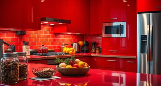
Opt for Monochrome for a Seamless, Expansive Look
Choosing a monochrome palette can instantly create a sense of harmony and openness in your home. By sticking to variations of a single color, you leverage color psychology to evoke calm, warmth, or energy, depending on your choice. This approach simplifies the visual experience and enhances the feeling of space. Understanding color symbolism helps you select shades that align with your intentions—blue for tranquility, green for growth, or neutrals for sophistication. Monochrome schemes also make your décor feel seamless and cohesive, making rooms appear larger than they are. When you use different textures and subtle tonal shifts within the same hue, you add depth without breaking the sense of flow. It’s an effective trick to create an inviting, expansive atmosphere effortlessly.
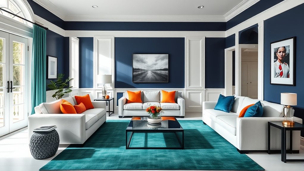
Incorporating Color Blocking to Define and Enlarge Areas
Building on the idea of monochrome schemes, incorporating color blocking offers a dynamic way to define and enlarge different areas within your home. By strategically placing contrasting colors side by side, you can manipulate spatial perception, making rooms feel bigger or more intimate. Color blocking creates visual boundaries that highlight specific zones, guiding the eye naturally across your space.
Imagine walking into a living room where a bold, dark color on one wall contrasts with lighter shades elsewhere, instantly enlarging the area. You can also use color blocking to:
- Emphasize architectural features or furniture
- Create the illusion of higher ceilings
- Divide open-plan spaces into functional zones
- Draw attention to focal points
This technique transforms your décor into a clever illusion that plays with perception.
Trick the Eye With Reflective and Glossy Finishes
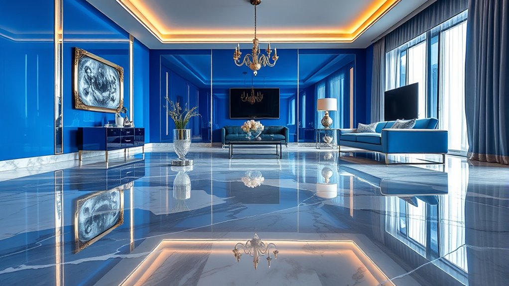
Reflective and glossy finishes are powerful tools that can instantly transform your home’s ambiance by playing with light and perception. Using reflective surfaces, like mirrors or polished furniture, creates a sense of depth and openness, making small spaces feel larger. Glossy finishes on walls, cabinets, or flooring bounce light around the room, enhancing brightness and vibrancy. These finishes can make colors appear more intense and vivid, adding energy to your décor. When strategically placed, reflective surfaces and glossy finishes trick the eye into perceiving more space and luminosity than actually exists. They also introduce a sleek, modern touch that elevates your interior design. Incorporating these tricks allows you to manipulate light, making your home feel more spacious, lively, and visually engaging. Additionally, understanding how visual perception influences our environment can help you choose the most effective finishes for your space.
Frequently Asked Questions
How Do Color Choices Affect Room Mood and Atmosphere?
Your color choices directly influence the room’s mood and atmosphere by triggering emotional responses. For example, warm colors like red and yellow evoke energy and passion, while cool colors like blue and green promote calmness and relaxation. Understanding color symbolism helps you select shades that align with your desired ambiance, making your space feel more inviting. So, choose colors thoughtfully to create the emotional vibe you want to experience every day.
Can Color Tricks Influence Perceived Room Temperature?
You might wonder if color tricks can influence perceived room temperature. Based on color psychology and visual perception, warm colors like reds and oranges can make a space feel warmer, while cool shades like blues and greens create a cooler vibe. By strategically choosing colors, you can trick the eye into perceiving a room as warmer or cooler than it actually is, enhancing comfort without changing the thermostat.
Are Certain Colors More Suitable for Small or Large Spaces?
Certain colors work better in small or large spaces based on color psychology and how they influence your spatial perception. Light, neutral shades like whites and pastels make small rooms feel more open and airy. Bold, dark colors can add coziness in large rooms, but might overwhelm smaller ones. You can use these principles to choose colors that enhance your space, making it feel more balanced and inviting.
How Do Lighting Conditions Impact Color Illusion Effectiveness?
Imagine your room transforming dramatically with the right lighting ambiance—you’ll be amazed how shadows play tricks on your perception! Lighting conditions can make or break color illusions, amplifying or softening their effects. Bright, warm lights intensify colors and create lively illusions, while dim, cool lighting dulls them, making spaces seem larger or smaller. Pay attention to shadow play and lighting styles to maximize your home’s visual magic!
What Are Common Mistakes to Avoid When Using Color Illusions?
When using color illusions, you should avoid disrupting color harmony, which can make the illusion less effective. Don’t choose colors that clash or overwhelm the space, as this can negatively impact the psychological effects you want to evoke. Also, be cautious with lighting, since it influences how colors are perceived. By maintaining balance and understanding how colors influence mood, you’ll create a more compelling and harmonious visual experience.
Conclusion
As you explore these color tricks, remember that sometimes, what you see isn’t the whole story—you’re crafting an illusion. A simple choice, like a reflective surface or bold contrast, can transform your space in unexpected ways. Keep experimenting and trusting your instincts—just like colors can deceive the eye, your vision can reveal new possibilities. After all, the magic of home décor lies in discovering how perception shapes your environment.