
Blue is often seen as a calming color because of its historical associations with trust and tranquility, supported by scientific studies showing it can lower heart rate and promote relaxation. However, recent research highlights that emotional responses to blue aren’t universal—they vary based on culture, personal experiences, and context. So, while blue might calm some, it might not have the same effect for everyone. If you’re curious about the true impact of blue, there’s more to discover.
Key Takeaways
- Scientific studies show blue can lower heart rate and promote relaxation, supporting its calming reputation.
- Cultural perceptions of blue as trustworthy and serene reinforce its association with calmness in many societies.
- Responses to blue are influenced by personal experiences and cultural context, making its calming effect variable.
- Blue’s emotional impact depends on environment, shade, and individual differences, challenging the idea of universal calmness.
- Popular myths about blue’s soothing qualities are supported by science but are also shaped by cultural symbolism and personal perception.
The Origins of Color Psychology and Blue

Color psychology has intriguing roots that trace back centuries, but blue’s significance has always stood out. Historically, blue symbolized trust, loyalty, and calmness, evident in ancient civilizations like Egypt, where it represented protection and divinity. Artistic color use further shaped its meaning; Renaissance painters used blue to evoke serenity and spirituality in their works. Over time, these associations influenced how societies viewed the color, embedding a sense of stability and tranquility. You can see this in religious iconography, royal attire, and even modern branding, where blue continues to convey reliability. Additionally, research into color symbolism underscores how these historical associations influence our emotional responses today. These deep-rooted symbols and artistic choices laid the groundwork for understanding blue’s emotional impact today. Recognizing this history helps clarify why blue has long been linked to peace and calmness.
Scientific Evidence Supporting Blue’s Calming Effects

Scientific studies show that blue can synchronize your brainwaves, promoting relaxation and focus. Research also indicates that exposure to blue shades can lower your heart rate, helping reduce stress. These findings support the idea that blue has genuine calming effects, backed by solid scientific evidence. Additionally, incorporating blue into your workspace can enhance overall productivity and well-being by leveraging its psychological benefits.
Brainwave Synchronization Effects
When you focus on blue hues, your brain may naturally synchronize its wave patterns to match the calming qualities of that color. This process, known as neural entrainment, helps your brain align its electrical activity with external stimuli like blue light. Research indicates that exposure to blue can influence sensory modulation, promoting slower brainwave frequencies associated with relaxation. As your brain synchronizes with these calming stimuli, you may experience a reduction in stress and heightened feelings of tranquility. This synchronization isn’t just coincidence—scientific studies support that blue light can actively induce brainwave patterns linked to calmness. By engaging in environments or activities that emphasize blue, you potentially enhance this neural entrainment, reinforcing blue’s calming effects through direct brainwave modulation. Additionally, understanding the role of sound design in creating soothing auditory environments can further amplify these relaxation responses.
Reduced Heart Rate Studies
Research shows that exposure to blue light can lead to measurable reductions in heart rate, supporting its calming effects. This aligns with findings from color therapy, where blue hues evoke a soothing emotional response. Studies reveal that individuals exposed to blue environments often experience decreased heart rates, indicating relaxation. Here’s a summary of key findings:
| Study | Result |
|---|---|
| Color therapy trials | Lowered heart rate during blue exposure |
| Controlled experiments | Emotional response linked to calmness |
| Light exposure studies | Reduced stress indicators |
| Environmental tests | Blue spaces promote relaxation |
These studies demonstrate how blue influences physiological and emotional responses, reinforcing its reputation as a calming color supported by scientific evidence. Additionally, research in AI in Education suggests that calming colors like blue can enhance learning environments by reducing stress and improving focus.
Anxiety and Blue Shades
Numerous studies confirm that blue shades can substantially reduce anxiety levels. This supports the idea that color therapy can effectively aid mood regulation. When you surround yourself with blue hues, your body responds by calming your nervous system. Research highlights three key findings:
- Blue light exposure lowers cortisol levels, decreasing stress.
- Blue environments promote relaxation and focus, reducing feelings of anxiety.
- Consistent use of blue in therapeutic settings enhances mood stability over time.
- Incorporating mindful decluttering practices can create a more calming environment that amplifies blue’s soothing effects.
These findings suggest that incorporating blue shades into your environment can be a simple yet powerful way to manage anxiety. The scientific evidence underscores blue’s role in calming the mind and body, reinforcing its reputation as a soothing color for mood regulation.
Recent Studies Challenging Traditional Beliefs

Recent studies are challenging long-held beliefs about color perception, revealing that many assumptions are more influenced by cultural conditioning than by innate responses. For example, research shows that color therapy’s effectiveness varies across cultures, suggesting emotional responses to colors are learned rather than universal. You might have been told blue is calming based on traditional beliefs, but recent findings indicate that your emotional response depends heavily on personal experiences and cultural context. These studies highlight that color’s impact on mood isn’t fixed; it’s shaped by social influences. By understanding this, you can realize that the calming effect attributed to certain colors might not be universal. Instead, your reactions to color are complex, adaptable, and more personalized than traditionally believed. Additionally, personality traits such as individual differences can influence how colors are perceived and experienced emotionally.
Cultural Influences on Color Perception

Cultural influences deeply shape how you perceive and interpret colors, often more than biological factors do. Your understanding of color varies across societies, rooted in cultural symbolism and regional preferences. For example:
Cultural symbols and regional norms shape how you see and respond to colors worldwide.
- In Western cultures, white often symbolizes purity and weddings, while in some Asian cultures, it’s linked to mourning.
- Red is associated with luck and celebration in China, but signifies danger or warning elsewhere.
- Green may represent nature and growth in many regions, yet can also be connected to envy or illness.
These differences highlight how cultural symbolism influences your emotional response and perception of colors. Regional preferences shape the colors you find appealing or appropriate, demonstrating that your color perceptions are not universal but culturally constructed. Additionally, creative practice shows that engaging with colors intentionally can help you understand and appreciate these cultural differences more deeply.
Practical Implications for Design and Environment

Understanding how cultural perceptions influence color meaning guides you in creating spaces and products that resonate with diverse audiences. By considering color symbolism, you can evoke specific emotions and reinforce brand identity or mood effectively. For example, blue often symbolizes trust and calmness, making it ideal for healthcare environments, but in some cultures, it may carry different connotations. Incorporating these insights helps foster environmental harmony—where colors complement the surroundings and promote well-being. When designing, choose palettes that align with the intended message and cultural context, ensuring your environment feels welcoming and balanced. Being mindful of color symbolism allows you to craft spaces that not only look appealing but also support emotional comfort and cultural sensitivity. Recognizing the wealth of female singers and their impact on popular culture can also influence your choice of colors to appeal to diverse audiences. This approach ultimately enhances user experience and strengthens your design’s impact.
Rethinking the Power of Color in Mood and Behavior

While color is often seen as a straightforward tool for influencing mood and behavior, new perspectives reveal that its effects are more complex and context-dependent than traditionally believed. Your perception of color is shaped by factors like color symbolism and current fashion trends, which evolve over time. Instead of fixed responses, consider that:
- Cultural background alters how you interpret color symbolism, affecting your emotional reactions.
- Fashion trends influence how certain colors are perceived, shifting their psychological impact.
- Personal experiences and environment play a pivotal role in how color affects your mood, often overriding general assumptions.
- By understanding Cultural Intelligence, you can better grasp how diverse backgrounds shape individual responses to color, making your approach to design or marketing more effective.
Understanding this complexity helps you see that color’s power isn’t universal but fluid, shaped by context, culture, and personal associations.
Frequently Asked Questions
Can Individual Differences Influence How We Perceive Blue’S Calming Effect?
Individual differences definitely influence how you perceive blue’s calming effect. Your personal color preferences and individual mood variability shape your emotional response to blue, meaning it might soothe you while having little impact on someone else. Your unique experiences and cultural background also play a role, making the perception of blue’s calming qualities subjective rather than universal. So, what relaxes you might not have the same effect on others.
Are There Specific Shades of Blue That Are More Calming Than Others?
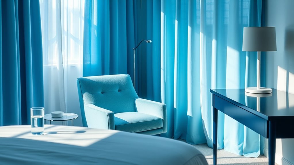
Imagine a wave crashing over you — that’s how powerful shade variations and color saturation can be in blue. You’ll find that softer, desaturated shades, like powder or pastel blue, feel insanely calming, like a gentle breeze. Bright, highly saturated blues, however, can energize rather than soothe. So, if you want true calm, stick to muted, low-saturation shades—your mind will thank you for it.
How Does Lighting Environment Alter Blue’S Impact on Mood?
Lighting environment markedly influences blue’s effect on your mood. Warmer lighting temperatures can make blue appear softer and more comforting, while cooler temperatures may enhance its calming qualities. Bright room lighting amplifies blue’s soothing impact, helping you feel relaxed and focused, whereas dim lighting might lessen this effect. So, adjusting room brightness and lighting temperature can optimize blue’s calming influence, making your space more peaceful and conducive to relaxation.
Is Blue’S Calming Effect Consistent Across All Age Groups?
Did you know that studies show children respond more positively to blue in color therapy than adults? Your perception of blue’s calming effect varies across age groups due to color psychology, which suggests that younger people often find blue soothing, while older individuals may not experience the same level of calm. So, blue’s calming impact isn’t consistent for everyone; it depends on age and personal experiences.
Can Personal Experiences Override Cultural Influences on Color Perception?
You might find that personal experiences can sometimes override cultural conditioning in color perception. While cultural influences shape your general associations with colors, your subjective interpretation depends on individual memories and feelings. For example, if blue reminds you of a peaceful place, that emotional response may outweigh societal stereotypes. So, your personal experiences can indeed influence how you perceive and respond to colors, sometimes more than cultural conditioning does.
Conclusion
So, next time you see blue, remember it’s not just a calming hue like a gentle breeze but a complex color shaped by science and culture. While many believe it soothes your mind, the truth is more like a mosaic—full of varied pieces and perspectives. Don’t just rely on stereotypes; explore how colors truly influence you. After all, understanding color’s power is like revealing a secret garden—full of surprises waiting to be discovered.