Color choices in your space can secretly influence your mood, stress, and creativity without you realizing it. Warm hues like reds and oranges boost energy and passion, while cool blues and greens promote calmness and focus. Neutral tones provide stability but can feel dull if overused. Cultural perceptions and personal associations also shape how you respond to colors. If you’re curious about harnessing color psychology to enhance your environment, there’s more to discover underneath the surface.
Key Takeaways
- Warm colors like reds and yellows evoke energy, passion, and excitement, boosting motivation and alertness in a space.
- Cool shades such as blues and greens promote calmness, relaxation, and reduce stress, creating a peaceful environment.
- Neutral tones provide stability and balance, helping to alleviate anxiety and support emotional well-being.
- Bright, stimulating colors can increase alertness but may cause overstimulation if overused, impacting mood negatively.
- Cultural and personal associations with specific colors influence their psychological impact and emotional response.
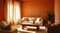
The Hidden Power of Warm and Cool Colors
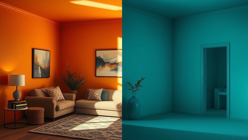
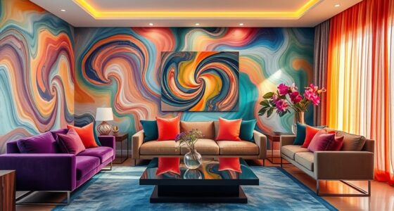
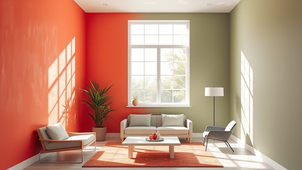
Colors don’t just decorate a space—they influence how you feel. Warm colors like reds, oranges, and yellows evoke energy, passion, and warmth through their color symbolism, often triggering emotional responses linked to excitement or comfort. Conversely, cool colors such as blues, greens, and purples tend to promote calmness, relaxation, and serenity. Your brain interprets these hues instantly, shaping your mood without you realizing it. When you see warm shades, you might feel invigorated or enthusiastic; with cool shades, a sense of peace or focus may emerge. Understanding this hidden power helps you choose paint colors intentionally, aligning your environment with the emotional responses you want to foster—whether it’s vitality or tranquility. Additionally, incorporating color psychology principles into your decorating choices can enhance your overall well-being and productivity in any space.
How Color Influences Your Stress Levels
Colors can considerably impact your stress levels, so choosing the right shades matters. Calming blue hues help reduce anxiety, while warm earth tones create a cozy, grounding effect. Bright, stimulating colors, on the other hand, can heighten alertness but may also increase stress if overused. Additionally, understanding your personality traits can help you select colors that align with your individual responses to different shades.
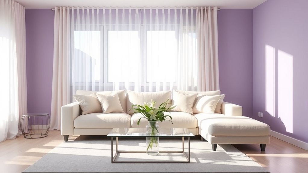
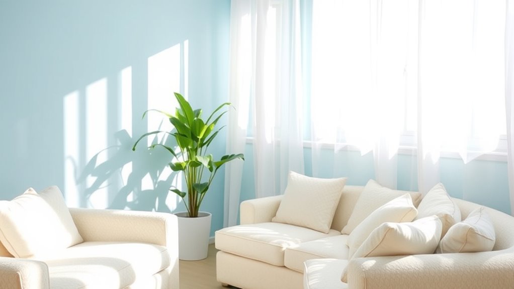
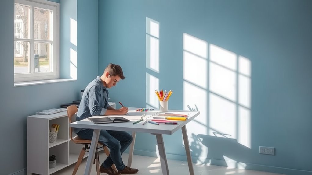
Calming Blue Shades
Have you ever noticed how a peaceful blue sky can instantly make you feel more relaxed? That’s the power of calming blue shades in color therapy. These hues are known for their mood enhancement qualities, helping to reduce stress and promote tranquility. When you incorporate soft blues into your space, your brain associates it with open skies and calm waters, encouraging a sense of peace. Blue shades lower cortisol levels and slow your heart rate, making you feel less anxious. Whether used on walls or in accents, calming blue tones create an environment that fosters relaxation. By choosing these colors, you harness their stress-relieving properties, making your home or workspace a soothing sanctuary. Incorporating artistic elements such as paintings or decor in blue tones can further enhance this calming effect. Blue’s gentle influence can truly help you unwind and recharge.
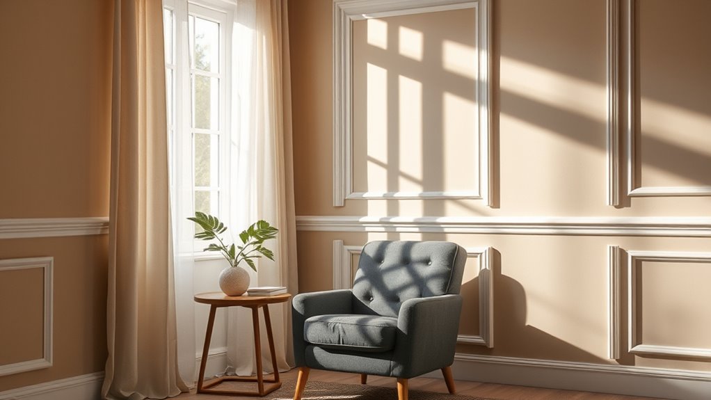
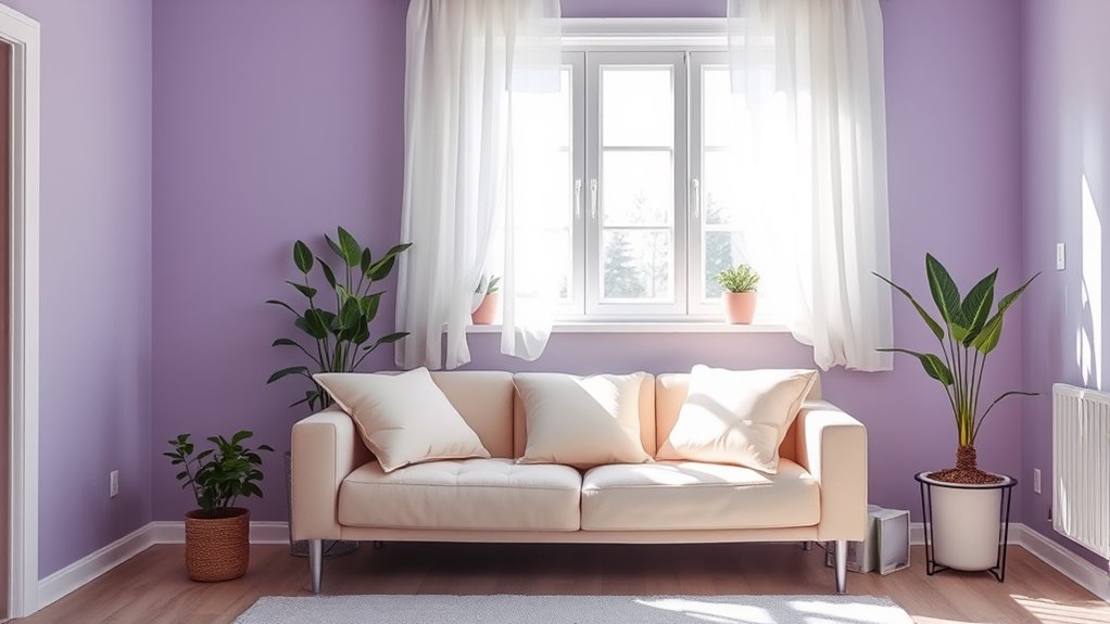
Warm Earth Tones
After experiencing the calming effects of blue shades, it’s natural to explore how warmer tones influence your mood. Warm earth tones, like terracotta, beige, and soft browns, create a sense of stability and comfort through their emotional resonance. In color therapy, these hues are known to reduce stress by grounding your emotions and fostering a peaceful environment. They evoke feelings of security and coziness, helping you unwind after a stressful day. By surrounding yourself with warm earth tones, you can enhance your overall sense of well-being, making your space feel inviting and safe. These colors subtly influence your mood, encouraging relaxation without overwhelming your senses, and promote a balanced, stress-free atmosphere. Additionally, understanding color psychology can help you select the most effective hues for your personal comfort and mental health.
Bright, Stimulating Colors
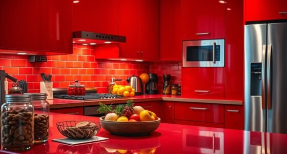
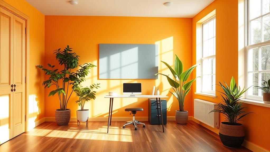
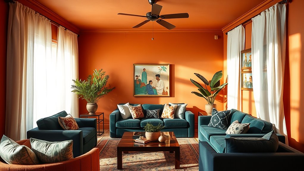
Bright, stimulating colors like vibrant reds, energetic yellows, and lively oranges can markedly influence your stress levels by energizing your environment. In color therapy, these hues are often used to boost motivation and combat fatigue. However, they can also elevate stress if overused, making spaces feel overwhelming. Understanding paint symbolism helps you choose colors that promote balance rather than agitation. For example, red symbolizes passion but may increase anxiety when too intense; yellow inspires happiness but can cause agitation in excess. Using these colors thoughtfully can enhance your mood, but beware of their power to stimulate or overstimulate. By applying bright, stimulating colors strategically, you can create an environment that energizes without adding unnecessary stress.
The Surprising Impact of Color on Creativity and Focus
Color has a powerful influence on your ability to think creatively and stay focused. Different hues carry specific color symbolism and emotional associations that can boost your productivity or hinder your concentration. For example, blue often symbolizes calmness and clarity, helping you stay focused during demanding tasks. Meanwhile, green is linked to balance and renewal, fostering fresh ideas and creativity. Bright, stimulating colors like red can energize your mind, but may also be distracting if overused. Understanding these connections allows you to choose paint colors intentionally, aligning emotional associations with your goals. When you select colors that resonate with the mood you want to cultivate—whether creativity or concentration—you create an environment that actively supports your mental performance. Additionally, the emotional impact of colors can influence your overall well-being and motivation throughout the day.
Unveiling the Truth About Neutral Tones and Emotional Balance
Neutral tones like beige, gray, and taupe are often chosen for their versatility and calming effects, but their influence on emotional balance goes beyond aesthetics. These colors create a soothing environment that helps reduce stress and promote stability, making them ideal for spaces where you seek peace. However, their subdued nature can also evoke feelings of dullness or detachment if overused. When you incorporate neutral tones thoughtfully, you foster emotional balance by providing a stable backdrop that doesn’t overwhelm your senses. They act as a foundation for other colors or decor to shine, supporting your mental well-being. Additionally, the choice of color accuracy in your environment subtly affects how these tones are perceived, influencing your overall mood. Ultimately, neutral tones influence your emotional state subtly but profoundly, helping you feel centered and calm without distraction or excess stimulation.
The Psychological Effects of Bright and Muted Shades
Bright shades can boost your energy and make a space feel more lively. In contrast, muted tones often create a calming atmosphere that helps you relax. Understanding these effects can help you choose colors that support your mood and daily activities. Additionally, incorporating color psychology principles can further enhance the emotional impact of your interior design choices.
Bright Shades Enhance Energy
When you surround yourself with bright shades, your energy levels can considerably increase. Bright colors, rooted in color therapy, are known to stimulate activity and uplift your mood. They also carry strong color symbolism that promotes enthusiasm and alertness. To harness this effect, consider these strategies:
- Use bold shades like yellow or orange in spaces where you need motivation.
- Incorporate accents of bright hues to energize a room without overwhelming it.
- Pair bright colors with neutral tones to balance intensity and avoid overstimulation.
- Limit the use of bright shades in spaces meant for relaxation, reserving them for areas where activity thrives.
- Additionally, incorporating well-being tips such as selecting supportive furniture or calming accessories can help create a balanced environment that boosts mood without causing stress.
Muted Tones Promote Calm
While vibrant hues can energize your space, opting for muted tones creates a sense of calm and tranquility. Muted shades with lower color saturation soften your environment, making it more relaxing. Choosing a matte or eggshell paint finish further reduces glare, enhancing the soothing effect. These subtle colors help you unwind and focus, especially in bedrooms and living areas. To understand their impact, consider this table:
| Shade Type | Effect on Mood | Best Use |
|---|---|---|
| Soft Gray | Promotes serenity | Bedrooms, offices |
| Dusty Blue | Eases anxiety | Living rooms |
| Muted Green | Encourages balance | Meditation spaces |
Muted tones foster calm by minimizing visual noise, making your space feel more peaceful and inviting. Understanding color psychology can help you make the best choices for your environment.
Why Certain Colors Can Boost Your Productivity
Have you ever noticed how certain colors seem to energize your work and help you focus? That’s because color symbolism and personal associations influence your productivity. Bright, stimulating hues can trigger your brain to stay alert. Consider these examples:
Colors that energize your work and boost focus through symbolism and personal meaning.
- Blue: Often linked to calm and focus, it promotes concentration and reduces stress.
- Green: Symbolizing growth and balance, it fosters harmony and refreshes your mind.
- Yellow: Bright and cheerful, it encourages optimism and creativity.
- Orange: Energetic and motivating, it can boost enthusiasm and drive.
Your personal associations with these colors, shaped by experiences, can amplify their effects. Choosing colors that resonate with you can create an environment that naturally enhances your productivity and keeps you engaged. Incorporating color psychology principles into your space design can further optimize your mood and efficiency.
The Role of Cultural Perceptions in Color Psychology
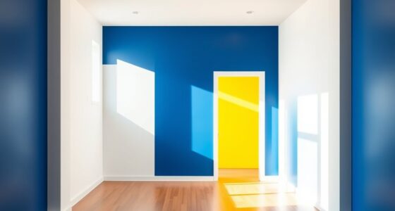
Color perceptions are deeply rooted in cultural contexts, shaping how you respond to different hues regardless of their psychological effects. Cultural symbolism influences how colors are interpreted; what signifies luck in one culture might mean mourning in another. Regional color meanings play a significant role in shaping your reactions—red may symbolize prosperity in China, while it can evoke warning or danger in Western countries. These cultural perceptions impact not only your personal preferences but also how spaces are designed and experienced. When choosing paint colors, understanding regional color meanings helps you align your environment with your cultural background or desired emotional response. Recognizing the power of cultural symbolism allows you to make more intentional choices that resonate on a deeper level.
Tips for Choosing Paint Colors That Align With Your Mood Goals
Choosing paint colors that support your mood goals starts with understanding how different hues influence your emotions. Color therapy reveals that certain colors evoke specific emotional resonance, helping you craft spaces that foster well-being. To select the right shades:
- Identify your desired mood—calm, energize, or focus—and choose colors aligned with that.
- Use softer tones like blues or greens for relaxation and stress relief.
- Incorporate warm shades like yellows or oranges to boost energy and creativity.
- Test paint samples in your space to observe how lighting and surroundings affect emotional resonance.
Frequently Asked Questions
Can Color Therapy Actually Improve Mental Health Long-Term?
Color therapy can positively impact your mental health, but its long-term benefits depend on consistent use and individual response. By intentionally choosing calming or energizing colors, you may reduce stress, boost positivity, and promote emotional balance over time. While it’s not a cure-all, incorporating color therapy into your routine can support your mental health journey, especially when combined with other self-care practices and professional guidance.
Do Personal Experiences Override Universal Color Psychology Principles?
You might wonder if your personal experiences can rewrite the rules of color psychology. While subjective perception and cultural differences paint unique emotional landscapes, they rarely override universal principles. Think of color psychology as a map—your personal journey adds detail, but the terrain remains consistent. Your experiences shape how colors influence you, yet universal truths still guide how hues affect mood, blending science with your personal story.
How Do Lighting Conditions Alter the Perceived Mood of Colors?
Lighting effects dramatically influence your perception of color and mood. When lighting is warm and soft, colors appear cozier and calming, enhancing comfort. Bright, cool lighting makes colors seem more energetic or even stark, shifting the mood to alertness or sterility. You’ll notice that different lighting conditions alter how you experience a room’s atmosphere, proving that light plays a vital role in shaping your emotional response through color perception.
Are There Specific Colors Best Suited for Emotional Healing?
You might find that certain colors promote emotional healing, but it depends on personal preferences and cultural differences. For example, green symbolizes growth and balance in many cultures, making it soothing and restorative. Color symbolism varies worldwide, so choose hues that resonate with your cultural background and personal experiences. Soft blues and gentle greens often foster calmness, aiding emotional recovery, but ultimately, trust your instincts when selecting colors for healing.
How Does Age Influence Individual Responses to Color Psychology?
You might find that age influences your responses to colors, as research shows age-related preferences often shift over time. For example, older adults tend to favor calming hues like blues and greens, while younger generations prefer vibrant, energetic shades. Your personal reactions align with generational color trends, meaning your age shapes how you experience and choose colors, impacting your mood and environment. Embracing these trends can help you create spaces that truly resonate with you.
Conclusion
Did you know that nearly 60% of people report feeling happier in rooms painted with warm colors? By understanding how paint colors influence your mood, you can create spaces that boost your well-being and productivity. Don’t underestimate the power of a simple color choice—it’s a quick, impactful way to improve your daily life. So next time you’re painting, choose colors that align with your mood goals and watch your environment transform.