
Discover ten unexpected accent colors that actually work to transform your space. Think about pairing teal with red for a cozy yet vibrant vibe, or coral with emerald green for a fresh, botanical look. Mustard with navy adds warmth and modernity, while poppy paired with ocean blue creates a lively yet calming atmosphere. Olive with berry or blush with poppy balances earthy and vibrant tones beautifully. Want more inspiring ideas? Keep exploring these surprising color combinations.
Key Takeaways
- Pair bold, unexpected hues like teal or coral with neutral tones to create vibrant yet balanced spaces.
- Use deep, rich shades such as navy or emerald green as accent colors for a modern, sophisticated look.
- Incorporate warm accents like mustard or berry to add unexpected warmth and depth to cool-colored palettes.
- Combine pastel tones like lilac or blush with vibrant colors such as poppy or coral for a playful, contemporary aesthetic.
- Use textured textiles and layered materials to enhance the visual impact of unconventional accent colors.
Vtopmart 25 PCS Clear Plastic Drawer Organizers Set, 4-Size Versatile Bathroom and Vanity Drawer Organizer Trays, Storage Bins for Makeup, Bedroom, Kitchen Gadgets Utensils and Office
- Versatile Drawer Organizer: Suitable for bathroom, kitchen, office, and more
- Includes 25 Storage Bins: Four sizes for customized organization
- Multiple Sizes Included: 9x6x2, 9x3x2, 6x3x2, 3x3x2 inches
As an affiliate, we earn on qualifying purchases.
Teal and Red: A Bold Yet Cozy Pairing
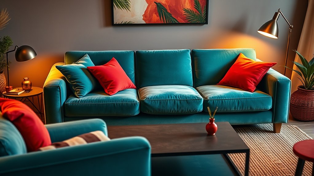
Teal and red form a striking yet inviting pairing that adds depth and vibrancy to any space. The contrast between teal’s cool tones and red’s warm hues creates a dynamic look that’s both energetic and sophisticated. When you incorporate teal with red accents—like cushions or accessories—you’ll enhance a cozy, autumnal atmosphere that feels rich and inviting. Using teal as a wall color paired with red furniture or decor pieces evokes a vibrant, lively vibe while maintaining a sense of depth. This pairing draws inspiration from nature, reminiscent of a forest with fiery fall leaves. When balanced thoughtfully with neutral tones, teal and red avoid clashing, resulting in a harmonious, eye-catching aesthetic that’s perfect for creating warmth and visual interest.
Copper Red and Black & White: Glamour With Depth
Have you ever considered how copper red accents can transform a black and white interior into a glamorous retreat? When you introduce copper red, it adds warmth and richness that perfectly complement the stark contrast of black and white. A copper red rug becomes a striking focal point, elevating the room’s sophistication. Metallic copper accents—like brass fixtures or accessories—bring a modern, luxe vibe. Textiles in velvet or copper enhance the glamorous interior, creating depth and visual interest. These color combinations emphasize contrast while balancing warmth, making your space feel both inviting and elegant. Incorporating color psychology can help you recognize how such color choices influence mood and perception. Understanding visual impact can guide you in arranging these accents for a harmonious look. Copper red truly adds a layer of depth that transforms any black and white setup into a stunning, glamorous haven. Additionally, considering space organization can help you arrange these accents effectively for maximum impact. To achieve a cohesive design, paying attention to interior harmony ensures that all elements work seamlessly together.
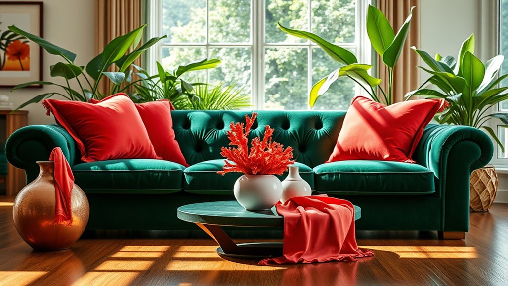
Coral and Emerald Green: Vibrant and Fresh
Coral and emerald green create a lively, eye-catching contrast that instantly energizes any space. This pairing draws inspiration from nature, offering a fresh, botanical vibe that feels both vibrant and inviting. When balanced with softer shades or floral patterns, it achieves a playful yet sophisticated look perfect for lively interiors. Incorporating these colors into a colorful investment portfolio can also add a sense of vibrancy and dynamism to your overall style. Using indoor gardening to introduce these colors through planters and accessories can further enhance this energetic aesthetic.
Vivacious Color Pairing
When paired thoughtfully, coral and emerald green create a lively and energetic contrast that instantly energizes any space. This vibrant color pairing evokes tropical and botanical themes, making your environment feel fresh and invigorating. Coral’s warm, vibrant tones work beautifully as accent pieces like cushions, art, or decorative accessories, while emerald green’s cool, rich hues anchor the look with depth. The combination balances warmth and coolness, resulting in a dynamic yet harmonious aesthetic. Perfect for lively kitchens, living rooms, or bedrooms, this vivacious color pairing draws inspiration from lush foliage and colorful flowers. It’s an organic, nature-inspired palette that adds a burst of vitality, making your space feel both vibrant and inviting.
Nature-Inspired Aesthetic
If you’re aiming to create a space that feels lively and connected to nature, pairing coral and emerald green offers a vibrant, invigorating aesthetic. Coral brings a warm, blooming quality reminiscent of coral reefs, while emerald green evokes lush foliage. Together, they create a dynamic, nature-inspired vibe that energizes any room. Using coral accents like cushions or wall art adds brightness, and emerald green furniture or textiles provide a grounding element. This combination draws from botanical palettes, making your space feel lively and organic. Incorporating color psychology can enhance the emotional impact of this pairing, fostering feelings of vitality and tranquility. It works especially well in sunlit living rooms or vibrant bedrooms, where the vibrant coral contrasts beautifully with the deep richness of emerald green. Incorporating these colors can also enhance the nature-inspired aesthetic by bringing a fresh, lively touch to your decor. Understanding the vibrational energy of these colors can help you align your space with feelings of renewal and harmony. Recognizing the importance of harmony in design can further optimize the overall balance of your space, creating a more cohesive environment. Embracing this pair can also influence your mood positively by promoting a sense of well-being and balance.
Balanced Brightness
Achieving a balanced brightness with coral and emerald green involves carefully pairing their vibrant and cool tones to create an energetic yet harmonious space. Coral’s lively warmth contrasts beautifully with emerald’s rich, cool shades, evoking a natural, tropical-inspired aesthetic. To prevent the contrast from feeling overwhelming, incorporate darker emerald hues, which add depth and stability. Textured fabrics like velvet or embroidered textiles enhance vibrancy and bring a tactile richness that elevates the pairing. Use coral as accent pieces or in key furniture to introduce cheerful brightness, while emerald green anchors the space with its cooling effect. Incorporating color schemes and thoughtful decor choices can also help create a calming atmosphere that balances the energetic colors. Incorporating sound healing, which utilizes specific frequencies to promote relaxation, can also help create a calming atmosphere that balances the energetic colors. For example, selecting calming lighting options can further enhance the serene ambiance. Additionally, choosing appropriate textures can add dimension and softness, making the space more inviting. This combination works well in living rooms or bedrooms, where a cheerful, invigorating atmosphere is desired without sacrificing balance. The result is a fresh, vibrant environment that feels both lively and cohesive.
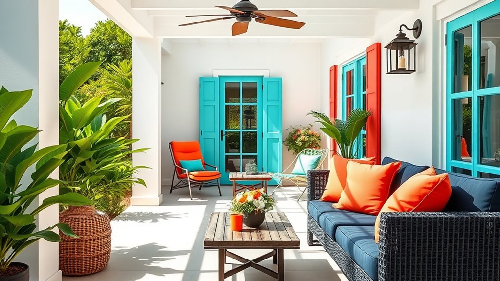
Orange and Shades of Blue: Calm Meets Energized
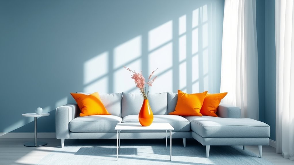
Orange and shades of blue create a dynamic balance that seamlessly blends calm and energy in interior design. Blue, especially subdued, grayed shades like slate or steel blue, acts as a calming neutral backdrop. When you add orange accents—think cushions, vases, or artwork—they introduce lively contrast and warmth without overwhelming the space. This pairing evokes both serenity and vitality, making it perfect for living rooms or creative areas. Using blue as a base with small doses of orange prevents visual fatigue while maintaining a vibrant aesthetic. The key is thoughtful placement: small pops of orange in an otherwise blue-dominated space add energy without disrupting the calming effect, creating a modern yet playful environment that feels balanced and inviting.
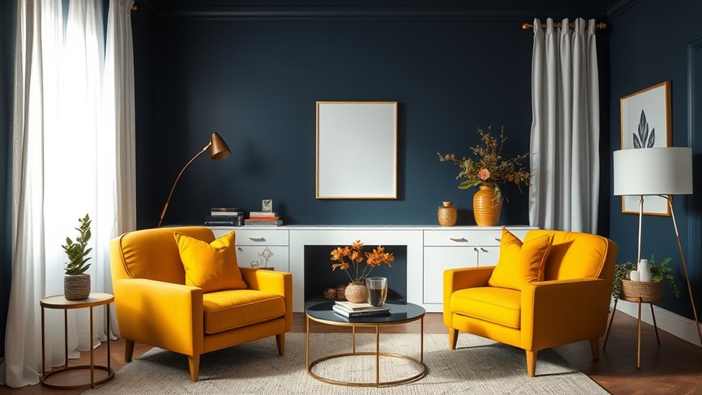
Mustard and navy combine to create a striking yet harmonious contrast that elevates any interior space. The warm, spicy hue of mustard pairs beautifully with navy’s deep, soothing shade, adding visual interest without overwhelming. This contrast blends warmth and coolness, giving your room a sophisticated, modern feel. Whether you’re updating a traditional or contemporary style, mustard and navy work well in various settings—from kitchens to bedrooms. Incorporate brass or gold accents to enhance the luxe vibe and tie the look together. Visual examples, like mustard-colored storage units against navy walls or upholstery, showcase how effortlessly these shades complement each other. This classic color pairing offers versatility, bringing warmth and depth while maintaining a fresh, modern twist. Additionally, understanding sleep solutions for new parents can help create a cozy environment that promotes restful nights, which is essential for overall health and well-being, and considering self watering plant pots can help maintain a lush, thriving indoor garden with minimal effort, further enhancing your space’s aesthetic and atmosphere. Incorporating educational toys for toddlers into your decor can also create a stimulating environment that encourages learning and development in a stylish way. Moreover, exploring Halloween-themed decorations can inspire creative ways to showcase these colors in festive setups, adding a playful touch to your home.
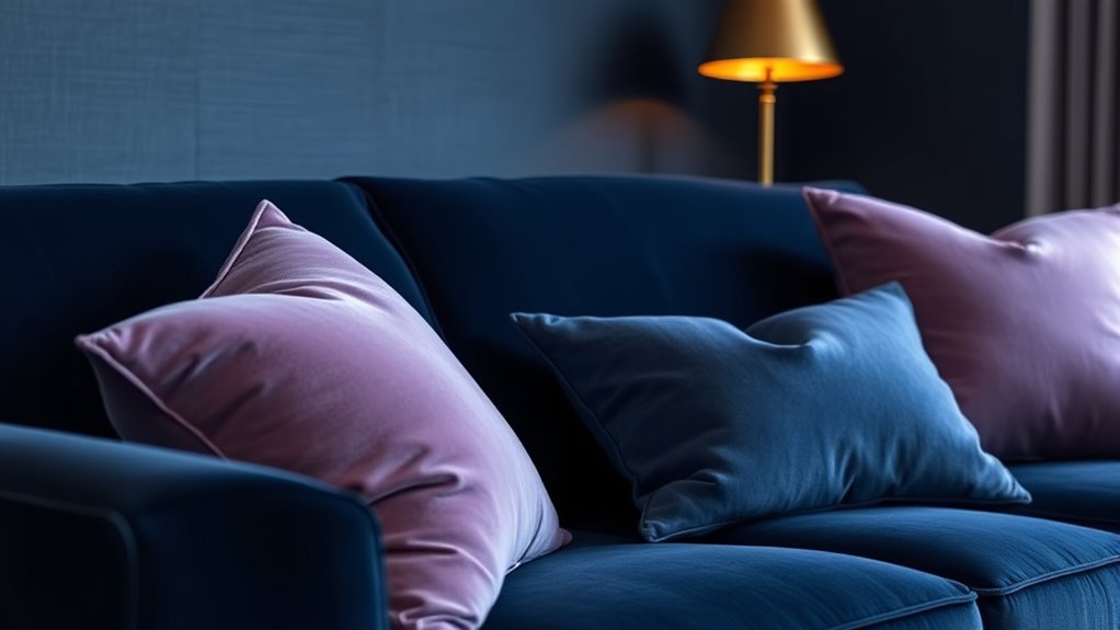
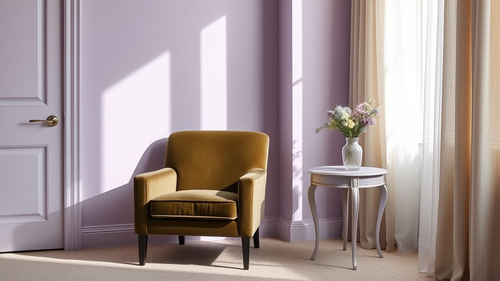
Navy and lilac create a striking contrast that exudes sophistication and modern elegance. This pairing offers versatile options, from bold accent pieces to subtle details that enhance your space. Together, they bring depth and softness, making any room feel both inviting and refined. Incorporating layered textures and colors can further elevate the aesthetic and create a more meaningful environment.
Sophisticated Color Contrast
The pairing of navy and lilac creates a striking contrast that exudes both sophistication and softness, making any space feel both luxurious and inviting. This combination showcases a compelling color contrast that balances deep tones with delicate hues, elevating your interior design. Navy’s rich, dark shade provides a grounding backdrop, enhancing lilac’s gentle pastel hue for a refined, contemporary look. Together, they form a sophisticated palette that evokes a mysterious yet elegant atmosphere, perfect for bedrooms, living rooms, or accent walls. Incorporating navy and lilac through accessories like cushions or curtains allows you to introduce this contrast subtly without overwhelming the space. This versatile pairing blends timeless appeal with modern sophistication, creating a look that’s both stylish and balanced.
Modern and Elegant Vibe
Building on the sophisticated contrast of navy and lilac, this pairing can also craft a modern and elegant atmosphere with a moody edge. The deep navy provides stability, while the soft lilac introduces a calming, refined touch. This unexpected color pairing is perfect for modern interior design, adding visual interest without overpowering the space. To maximize its impact:
- Use navy as the dominant color in walls or furniture to establish a sleek, contemporary foundation.
- Incorporate lilac accents through textiles, artwork, or accessories for subtle elegance.
- Enhance the moody vibe with metallic or matte finishes, amplifying the modern, sophisticated feel.
This combination creates a tranquil yet stylish environment, ideal for bedrooms or living rooms where tranquility and refinement are essential.
Versatile Design Combinations
Combining navy and lilac creates a versatile palette that effortlessly blends moody elegance with contemporary charm. These color schemes stand out as unexpected color combinations that bring depth and softness to interior design. Navy offers a stable, grounding tone, while lilac introduces a delicate femininity, creating a sophisticated contrast. This pairing elevates spaces like bedrooms and living rooms by merging classic and modern elements seamlessly. When you add metallic accents such as silver or brass, it amplifies the luxurious, moody appeal of the palette. The soothing yet dramatic contrast of navy and lilac makes it adaptable for various styles, from minimalistic to richly layered interiors. This versatile combination proves that unexpected colors can work harmoniously, enhancing the overall aesthetic with timeless sophistication.
Poppy and Ocean: Bright and Refreshing
Poppy’s bold, vibrant red instantly grabs attention, and pairing it with the soft, pastel blue of Ocean creates a lively yet calming effect. This color pairing offers a crisp, sophisticated look with vibrant accents that energize any space. To make the most of this combination, consider these tips:
- Use Poppy as a statement in accessories or furniture to add bold color.
- Complement it with Ocean walls or textiles for a balanced, soothing backdrop.
- Enhance the contrast with natural materials like light woods or neutral fabrics to keep the look inviting.
This unexpected duo works especially well in lively kitchens, playful bedrooms, or creative workspaces where vibrancy and inspiration are key. Embrace the harmony of bold color and calm, cool tones for a refreshing style.
Olive and Berry: Earthy and Rich

Olive and berry hues bring a natural harmony and depth to your space, blending earthy tones with rich accents. By pairing muted olive with vibrant berry, you create a balance that’s both calming and energizing. Adding blush or sage tones enhances the layered, organic feel, making your rooms feel cozy yet sophisticated.
Natural Harmony and Depth
Olive and berry tones together create a sophisticated palette that captures the essence of nature’s richness. This combination brings natural harmony and depth to any space, reminiscent of lush foliage and ripe fruit. The earthy olive green paired with vibrant berry hues produces a balanced contrast that feels both serene and lively. To enhance this effect, consider these points:
- Use textured fabrics like linen or velvet to emphasize organic qualities.
- Incorporate these shades across different elements for a layered, natural look.
- Rely on the harmony between muted greens and rich reds to evoke the feeling of a thriving landscape.
This earth-inspired duo offers versatility, fitting seamlessly into rustic, modern, or eclectic interiors, adding warmth and richness to your environment.
Vibrant and Soothing Balance
Building on the natural harmony of earthy tones, pairing olive green with berry purple creates a vibrant yet soothing atmosphere. This unexpected color combo balances the calming presence of olive green with the rich energy of berry purple, evoking a lush forest scene dotted with ripe berries. You’ll find it ideal for cozy living rooms or bedrooms, adding depth without overwhelming. Incorporate textured materials like linen, velvet, or woven baskets to enhance their tactile appeal and reinforce the organic vibe. This pairing offers versatile styling options, from rustic charm to modern elegance, depending on your accessory choices. The combination’s natural warmth and vibrant richness foster a sophisticated yet lively environment, making it perfect for creating spaces that feel both grounded and invigorating.
Blush and Poppy: Soft Meets Vibrant
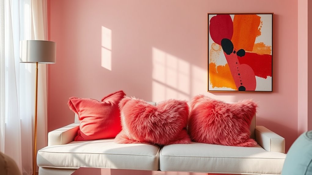
Blush and poppy create a compelling contrast that combines softness with vibrancy, making your space both calming and energetic. The gentle hue of blush provides a soothing background, while poppy red injects boldness and excitement. This color pairing works beautifully in bedrooms and living rooms, where the calming effect of blush balances the lively poppy accents. To maximize impact, consider these tips:
- Use blush as a base color for walls or textiles to set a soft tone.
- Incorporate poppy red through accessories like cushions or artwork for visual punch.
- Add textured textiles, such as velvet or embroidered shams, to enhance the sophisticated, playful vibe.
With the right balance, this duo evokes warmth and dynamism, creating a space that’s inviting yet energizing.
Lilac and Olive: Subtle Sophistication
When paired thoughtfully, lilac and olive green create a subtle yet sophisticated interior palette that exudes calm and elegance. These accent colors balance cool and warm tones, producing a natural, garden-inspired aesthetic that feels fresh and refined. Lilac’s soft pastel hue offers a calming contrast to the earthy, muted qualities of olive green, enhancing visual interest without overwhelming the senses. Incorporating textured fabrics like velvet or linen in lilac and olive tones adds depth and tactile richness, elevating the overall design. This unexpected pairing works seamlessly across different styles, from modern minimalism to traditional decor. Whether used on walls, furniture, or accessories, lilac and olive green bring a refined, inviting atmosphere that’s both subtle and striking.
Frequently Asked Questions
How Do I Balance Bold Accent Colors With Neutral Tones?
Balancing bold accent colors with neutral tones can transform your space. You should start by choosing one or two bold colors as focal points, then keep the rest of the room’s palette neutral to let those accents pop. Use neutral shades on walls and larger furniture, while adding bold accents through smaller accessories like pillows, art, or decor pieces. This contrast creates a lively, balanced environment that feels cohesive and stylish.
What Are the Best Rooms for Unexpected Accent Colors?
You can really make a statement in any room by adding unexpected accent colors. Living rooms and bedrooms are perfect because they’re personal spaces where bold choices feel natural. Kitchens and bathrooms also work well, especially with vibrant accessories or tiles. Just keep the rest of the decor neutral to let those accents pop. Trust your instincts, and don’t be afraid to experiment with daring colors—you might love the surprising energy they bring!
How Can I Incorporate Accent Colors Without Overwhelming the Space?
To incorporate accent colors without overwhelming your space, start small. Use accessories like throw pillows, artwork, or vases to add pops of color. Opt for neutral walls as a backdrop, allowing your accents to stand out subtly. Mix in different textures and shades for depth, and keep the overall palette balanced. This approach keeps your space lively without feeling chaotic, giving you a stylish, harmonious look.
Are There Seasonal or Trend Considerations for Choosing Accent Colors?
Imagine you’re updating your living room for fall. You might choose deep orange or rich burgundy accents, which are seasonal yet timeless. When selecting accent colors, consider current trends like muted pastels or bold jewel tones, but also think about your personal style and the room’s mood. Seasonal considerations help keep your space feeling fresh and relevant, making your decor both stylish and welcoming year-round.
How Do I Select Accent Colors That Complement My Existing Decor?
When selecting accent colors, you should consider your existing decor’s color palette and style. Look for hues that contrast or complement your main colors to create visual interest. Test small swatches or accessories with your current decor to see how they blend. Don’t shy away from bold or unexpected shades—sometimes they can add personality and vibrancy. Trust your instincts, and aim for balance to make your space feel cohesive.
Conclusion
Don’t shy away from these unexpected accent colors—they’re like hidden treasures waiting to brighten your space. Imagine a room where teal whispers coziness next to bold red, or coral sparks vibrancy amid emerald green. These unlikely pairings are like a symphony of colors, each note surprising yet harmonious. Embrace the unexpected, and watch your decor transform into a vivid canvas that invites curiosity and delight. Your perfect palette is just a daring splash away.