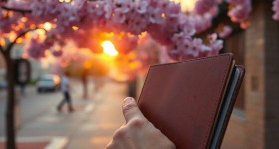

You’re influenced by hidden biases in color perception that shape your feelings and reactions without you realizing it. Designers knowingly exploit these biases by choosing colors that evoke specific emotions—such as red to create urgency or black for sophistication—depending on cultural and psychological cues. These subtle visual cues guide your attention and decisions, often without your awareness. If you want to discover how they craft these effects, keep exploring how color psychology influences your perceptions.
Key Takeaways
- Designers leverage cultural and psychological color associations to evoke specific emotions and influence perceptions subconsciously.
- Color biases can alter mood and decision-making, often without consumers being aware of their influence.
- Strategic color choices in branding and environments subtly steer behaviors, such as using red for urgency or black for sophistication.
- Awareness of these hidden biases helps consumers critically evaluate visual cues and resist unwanted influence.
- Recognizing how designers exploit color biases enhances perceptual consciousness and informed decision-making.
Color perception biases influence the way you interpret and respond to the colors around you, often without you realizing it. These biases are deeply rooted in your cultural interpretations and psychological effects, shaping your emotional reactions and decision-making processes. For example, in many Western cultures, white is associated with purity and cleanliness, making it a popular choice for weddings and healthcare branding. Conversely, in some Eastern cultures, white symbolizes mourning and death, which can evoke feelings of sadness or caution. Your cultural background influences how you perceive and feel about specific colors, often without conscious awareness. This means that a color’s meaning isn’t universal—what evokes positivity in one culture could provoke discomfort or indifference in another.
Color meanings vary across cultures, shaping your feelings and perceptions subconsciously.
Beyond cultural influences, psychological effects play a significant role in how you respond to colors. Colors can trigger emotional responses that impact your mood and behavior. Bright red, for instance, often stimulates excitement, energy, and even aggression, which is why it’s frequently used in advertising to grab attention or evoke urgency. Blue, on the other hand, tends to evoke feelings of calmness and trust, making it a favorite for corporate logos and financial institutions. These psychological effects are not arbitrary; they are subtle biases built into your subconscious, often manipulated by designers to guide your perceptions and actions. When you see a brand’s color palette, it’s not just about aesthetics—it’s about influencing your emotions and encouraging specific behaviors.
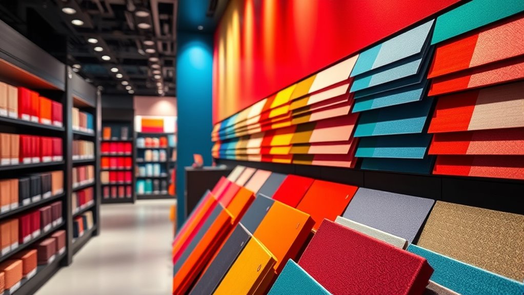
Designers exploit these biases intentionally, knowing that certain colors can influence your perceptions and choices without you realizing it. They leverage cultural meanings and psychological effects to craft environments, packaging, and advertisements that steer your attention and decision-making. For instance, fast-food chains often use red and yellow because these colors are known to stimulate appetite and create a sense of urgency. Similarly, luxury brands might choose black or gold to evoke sophistication and exclusivity. By understanding these biases, designers can subtly shape how you feel about a product or space, often nudging you toward a particular response without overt persuasion.
Recognizing the role of color perception biases in design can help you become a more conscious consumer and observer of visual influences. Ultimately, your perception of color is far from purely aesthetic; it’s a complex interplay of cultural and psychological biases that influence your reactions subconsciously. Recognizing these biases helps you become more aware of how your environment and the visual cues around you are intentionally crafted to evoke specific feelings and behaviors. Whether you realize it or not, these hidden biases steer your perceptions and choices daily, illustrating just how powerful the psychology of color truly is.

LOARTVE 9Pcs Mental Health Wall Art Prints Motivational Psychology Wall Decor Pictures Inspirational Quotes Colorful Therapy Office Posters for Office Bedroom Home Decoration 8x10in unframed
- Size: 8×10 inches unframed
- Design: Vibrant colors with inspirational quotes
- Use: Ideal for therapy and counseling spaces
As an affiliate, we earn on qualifying purchases.
As an affiliate, we earn on qualifying purchases.
Frequently Asked Questions
How Do Cultural Differences Influence Color Perception Biases?
Cultural differences shape your color perception biases through cultural symbolism and learned associations. For example, you might view white as purity in one culture but as mourning in another. These perceptual differences influence how you interpret colors and their emotional impact. By understanding these cultural nuances, you can better anticipate how different audiences perceive colors and avoid miscommunication or unintended connotations in your designs.
Can Understanding Biases Improve Marketing Strategies?
Knowing about biases can boost your marketing tactics considerably. For example, using red in a sale sign triggers urgency due to color psychology, prompting quicker purchases. When you understand how biases influence perception, you craft more compelling visuals and messages. This awareness helps you connect emotionally with your audience, making your campaigns more effective. So, yes, understanding biases enables you to tailor strategies that resonate and drive better results.
Are There Any Age-Related Changes in Color Perception Biases?
As you age, you experience perceptual shifts that lead to an age-related decline in color perception biases. This means your ability to distinguish certain colors diminishes, especially in low-light conditions, and your sensitivity to color contrasts changes. These shifts can affect how you perceive and respond to color in marketing, making it essential for designers to take into account age-related changes to create inclusive visuals that appeal across different age groups.
How Do Environmental Factors Impact Color Perception?
Did you know that lighting conditions can alter how you perceive colors by up to 20%? Environmental factors like ambient influences and natural or artificial lighting profoundly impact your color perception. When lighting is dim or uneven, your brain adjusts colors differently, which can lead to misinterpretations. So, you should always consider the environment around you, as it shapes how vividly or subtly you see and interpret colors.
What Role Does Individual Psychology Play in Color Bias?
You play a key role in your color biases through your individual psychology. Your cognitive predispositions shape how you interpret colors, often influenced by past experiences. Emotional associations also heavily impact your perception, making certain colors evoke specific feelings or memories. These factors work together, creating unique biases that affect your reactions to colors in everyday life, advertising, or design. Recognizing this helps you understand why colors can feel so personal.
Conclusion
Understanding your color perception biases reveals how designers subtly influence your choices. For example, studies show that people are 80% more likely to buy products with red labels, because red evokes urgency and excitement. By recognizing these hidden biases, you can make more informed decisions and appreciate the clever ways designers shape your perceptions. Next time you see bold colors, remember—they’re not just for looks—they’re crafted to influence your behavior in powerful ways.