
Pantone became a trendsetter by carefully selecting a Color of the Year that reflects current societal moods, emotions, and cultural shifts. This color influences design, fashion, and personal spaces, shaping perceptions subconsciously and setting visual standards worldwide. Its symbolic meaning resonates deeply, guiding trends and highlighting collective aspirations. If you want to understand how Pantone’s choices shape your environment and style, keep exploring the story behind this influential trendsetter.
Key Takeaways
- Pantone’s rigorous selection process reflects current cultural moods and societal shifts, positioning it as a trendsetter.
- The Color of the Year influences design, fashion, and consumer products, establishing a cohesive visual language.
- Pantone’s authoritative status stems from its expertise in color psychology and industry relevance.
- The chosen color subtly shapes emotions and perceptions, reinforcing societal values and collective aspirations.
- Pantone’s strategic marketing and global influence solidify its role as the leading arbiter of color trends.
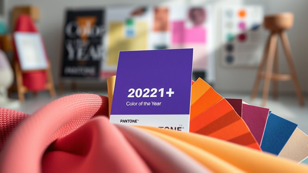
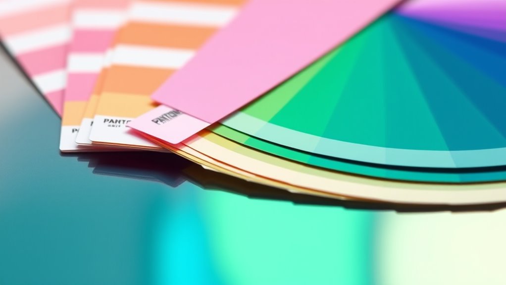
Have you ever wondered how the Color of the Year influences your surroundings? It’s more than just a trendy hue popping up in stores or on social media; it’s a carefully chosen shade that carries symbolic meaning and taps into the power of color psychology. When Pantone announces its Color of the Year, it sets a tone for design, fashion, and even your personal space. This color isn’t randomly picked—it’s selected because it reflects current cultural moods, societal shifts, and collective aspirations. Understanding this helps you see how a single color can shape emotions and perceptions without you even realizing it.
Color psychology plays a essential role in why Pantone’s choice resonates so deeply. Different shades evoke specific feelings and associations—blue might symbolize trust and calmness, while red can suggest energy or passion. The symbolic meaning behind a color influences how people respond to it, making the Color of the Year a powerful tool in setting an emotional tone. When Pantone chooses a particular hue, it’s not just about aesthetics; it’s about capturing the spirit of the moment. For example, if the chosen color embodies hope or resilience, it can inspire designers and consumers alike to incorporate that shade into their environments, subtly influencing mood and behavior.
Color psychology influences how the Color of the Year impacts our emotions and responses.
As you observe your surroundings, you’ll notice the impact of this annual color shift. Architects might select paint palettes that reflect the new trend, retailers might update their displays, and fashion designers will incorporate the hue into their collections. All of this contributes to a cohesive visual language that communicates shared values or aspirations. Knowing the symbolic meaning behind the color allows you to understand the underlying message it’s sending—whether it’s comfort, optimism, or innovation. It’s no coincidence that certain shades suddenly dominate home decor or branding; they’re chosen because they speak to what society needs or desires at that moment.
The influence of the Color of the Year extends beyond aesthetics—it taps into your subconscious through color psychology. When you see the new hue everywhere, it subtly shapes your feelings and perceptions. You might find yourself more drawn to spaces or products in that color, feeling a sense of harmony or motivation. Pantone’s role as the trendsetter isn’t just about picking a pretty shade; it’s about selecting a color with symbolic meaning that aligns with the collective mood, ultimately guiding how you experience and interpret your environment. This is why the Color of the Year holds such power—it’s a mirror of society’s emotional landscape, expertly curated to influence your world. Additionally, the popularity of certain shades and formulas in hair care and fashion demonstrates how these trends extend into personal styling and grooming choices.
Vtopmart 25 PCS Clear Plastic Drawer Organizers Set, 4-Size Versatile Bathroom and Vanity Drawer Organizer Trays, Storage Bins for Makeup, Bedroom, Kitchen Gadgets Utensils and Office
- Versatile Drawer Organizer: Suitable for bathroom, kitchen, office, and more
- Includes 25 Storage Bins: Four sizes for customized organization
- Multiple Sizes Included: 9x6x2, 9x3x2, 6x3x2, 3x3x2 inches
As an affiliate, we earn on qualifying purchases.
Frequently Asked Questions
How Does Pantone Choose the Color of the Year?
You might wonder how Pantone chooses the Color of the Year. They analyze color psychology, studying how hues influence emotions and behaviors. They also consider global trends, societal shifts, and branding strategies to select a color that resonates across industries. By blending these insights, Pantone picks a shade that captures the cultural mood, guiding designers and brands in creating impactful, trendsetting products and visuals for the year ahead.
What Industries Influence Pantone’s Color Selection Process?
Imagine over 10,000 professionals worldwide influencing Pantone’s choices. You should know that industries like corporate branding and interior design play a huge role in their process. When brands want to stand out or homes seek fresh vibes, they impact Pantone’s decision. You’ll notice these sectors shape the color trends you see everywhere, from sleek logos to cozy interiors, making the choices feel both stylish and relevant to your daily life.
Has the Color of the Year Ever Failed to Reflect Current Trends?
You might wonder if Pantone’s Color of the Year ever misses current trends. While it generally reflects prevailing moods, there have been times of historical inaccuracies and unexpected trend shifts that led to mismatches. Sometimes, the chosen hue doesn’t resonate immediately or aligns with evolving cultural shifts. Still, Pantone’s selections usually influence, rather than predict, trends, making it a reliable barometer despite occasional surprises.
How Can Designers Incorporate the Color of the Year Into Their Work?
You can incorporate the color of the year into your work by creating complementary palettes that highlight its vibrancy and versatility. Experiment with material integrations, like textiles or finishes, to add depth and texture. Use the color as a focal point or subtle accent, depending on your design goals. This approach guarantees your work stays fresh and relevant, seamlessly blending the trending hue with your unique style and vision.
Will Pantone’s Color of the Year Impact Global Fashion Trends?
You should consider that Pantone’s Color of the Year markedly influences global fashion trends through its strong color influence and trend forecasting. As a designer or consumer, you might notice that this color appears in clothing, accessories, and runway shows, guiding industry directions. Pantone’s authority helps set the tone for upcoming seasons, making it a powerful driver in shaping what’s fashionable worldwide.
Conclusion
As you embrace the Color of the Year, think of it as a sunrise breaking through darkness, symbolizing fresh beginnings and endless possibilities. Pantone’s choice isn’t just about hue—it’s a beacon guiding your style and mood toward optimism and renewal. Let this color be your compass, inspiring you to paint your world with hope and creativity. After all, in every shade, there’s a story waiting to unfold—yours.