
TL;DR

Get decor and gifts delivered free with Prime
- Fast, free delivery on millions of items
- Prime Video, Amazon Music and more included
- Member-only deals all year
A Livingetc report finds no consensus among designers on whether butter yellow will remain a lasting choice for home interiors or fade as a trend. Designers say its warmth and versatility support its continued use, while some caution that widespread, trend-driven application could make it feel overexposed; the report also points toward deeper, earthier shades as possible successors.
Interior designers disagree on whether butter yellow will last as a home color beyond its current popular moment, according to a Livingetc report looking ahead to 2027. Some describe the soft yellow as a versatile, warm alternative to white and gray; others say its future depends on whether homeowners genuinely like it and use it with restraint.
The report presents contrasting opinions, not a shared forecast or evidence that the color is already losing favor. Edinburgh-based designer Ailsa MacConnell of Studio Mac says butter yellow has been used for years and does not strike her as a fleeting trend. She attributes its staying power to a softness that lets it work with a range of colors without dominating a room.
Designer Laura Stephens takes a more qualified view. She says the shade itself can have longevity, but she would not treat a specific butter yellow as timeless in the same way as cream or stone. A popular color, she warns, can feel overexposed if it is used too literally or across an entire home. In her view, how people use the color may change even if the color remains appealing.
Other designers focus on personal taste and intention. Color consultant Charlotte Cropper says longevity depends on whether someone has always been drawn to the shade. Kelsey Coppetti of Los Angeles-based Studio Marrant says a color chosen mainly because it is fashionable may be phased out when another trend arrives. The report also discusses deeper, warmer and earthier shades as possible alternatives, but does not identify a definite successor or provide evidence of a market-wide shift.
A Color Choice Beyond the Trend Cycle
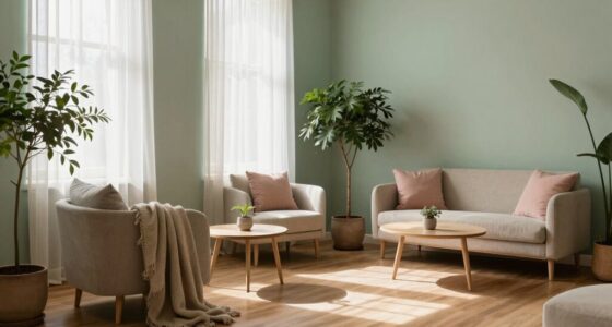
The disagreement matters to readers deciding whether to use a fashionable color in a room that may be expensive or difficult to redecorate. Butter yellow can serve as a middle ground between neutral and color: designers interviewed by Livingetc describe it as softer than bright yellow and warmer than stark white or cool gray. That makes it a potential option for people who want more color without making it the room’s dominant feature.
The designers’ advice is not a guarantee that the shade will remain popular. Instead, their comments suggest a practical distinction between personal preference and trend-led decorating. A homeowner who likes butter yellow may continue to enjoy it after the trend cycle moves on; someone choosing it only because it is currently prominent may be more likely to want a change. Using it selectively, or pairing it with materials and colors already suited to the space, may also make a room less dependent on a single trend.
As an affiliate, we earn on qualifying purchases.
Why Soft Yellow Returned to Interiors
Butter yellow is a soft pastel that designers associate with warmth and nostalgia. The report says its recent popularity follows years of interiors favoring stark whites and cool grays, as well as a broader appetite for more color. Its appeal, according to the designers, is that it brings some personality while retaining the softness people often seek from a neutral.
Rachel Rector of Florida design studio Chinotto House says yellow has appeared in a range of historical interiors, including 18th- and 19th-century European and American rooms, Spanish Mediterranean and Victorian designs, Colonial Revival spaces, and mid-century interiors. That history supports the view that yellow itself is not new, but does not establish that today’s particular butter-yellow trend will persist.
Designers cited in the report also connect the shade to warm timber, natural stone, aged brass and patterned fabrics. In one example, Farrow & Ball’s Hay paint is used on cabinetry alongside soft blue and burgundy; another described project uses it on bedroom joinery. These examples show ways the color has been applied, rather than proving how widely it is used or how long its current popularity will last.
““While it may be having a particularly strong moment now, I don’t see it as a fleeting trend.””
— Ailsa MacConnell, Studio Mac
No Successor Has Been Confirmed
The report offers designer opinion and prediction, not consumer polling, sales data or a forecast that can establish whether butter yellow is rising or declining in use. It does not name one confirmed replacement color. Its reference to shades with more depth, warmth and earthiness is a broad direction, and the source material does not provide enough detail to say which hues will become prominent or when.
It is also unclear how the trend will vary by room, region, budget or individual taste. The designers differ on whether the shade is inherently enduring, and their comments cannot settle that question for every home. What is confirmed is the disagreement itself: some see a useful, adaptable color, while others warn that popularity and overuse can affect how current it feels.
Watch How Homeowners Use Yellow
The report’s look ahead to 2027 is a designer forecast, not a scheduled industry announcement or a confirmed shift in decorating choices. The next useful signals would be whether designers continue specifying butter yellow and whether deeper, earthier colors appear more often in future projects and trend coverage. Livingetc’s report does not give dates or measurements for those developments.
For homeowners planning a room now, the designers’ comments point to a more immediate test: whether the color suits their own taste and the room’s materials, rather than whether it is forecast to remain fashionable. The longer-term direction of the trend remains open.
Key Questions
Is butter yellow considered timeless by designers?
There is no consensus. Ailsa MacConnell sees it as a lasting color, while Laura Stephens cautions against treating the specific shade as timeless in the same way as cream or stone.
Why has butter yellow become popular?
Designers cited in the Livingetc report connect its appeal to a preference for warmer, softer rooms after years of stark white and cool gray interiors. They also say it adds color without feeling as strong as brighter yellows.
What colors might follow butter yellow?
The report points generally to shades with more depth, warmth and earthiness. It does not name a confirmed successor or provide evidence that a particular color is taking over.
How can homeowners use butter yellow without overdoing it?
Designers suggest treating it as one element of a room rather than applying it everywhere. The report describes examples on cabinetry and bedroom joinery, alongside other colors and materials.
Does the report show butter yellow is already falling out of favor?
No. It reports differing designer views and possible future directions, but offers no usage data or market measurements showing that the color is declining.
Source: rss
Halloween Picks
halloween
As an affiliate, we earn on qualifying purchases.