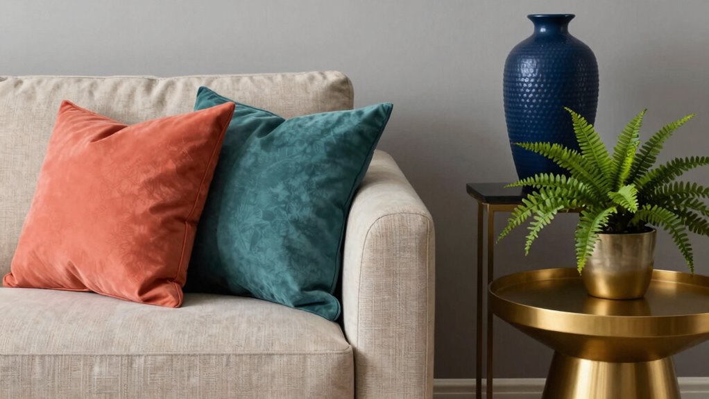

To choose accent colors that don’t fight each other, start with the color wheel. Pick complementary colors opposite on the wheel for contrast or analogous ones close together for harmony. Consider the mood you want to create and use textures or finishes to soften or enhance colors. Be aware of cultural meanings to evoke the right feelings. When you know how to balance bold and subtle hues, you’ll craft a space that feels cohesive—if you want to explore more, there’s plenty to discover.

Get decor and gifts delivered free — and shop member deals
- Fast, free delivery on millions of items
- Access to Prime Big Deal Days deals on October 6–7
- Prime Video, Amazon Music and more included
Key Takeaways
- Use the color wheel to select complementary or analogous accent colors for visual harmony.
- Balance bold, contrasting hues with softer, muted shades to prevent clashing.
- Consider cultural meanings and emotional impacts to ensure the colors evoke the desired mood.
- Mix textures and finishes to enhance color interaction and create visual interest.
- Ensure accent colors support the main palette, avoiding competition for attention.

Have you ever wondered how a pop of color can transform a room? Choosing the right accent colors is all about creating a balanced, visually appealing space without clashing. To do that, you need to understand the basics of color wheel harmony. The color wheel is your best friend here; it shows how colors relate to each other and helps you pick accent shades that complement your main palette. For instance, if your walls are a soft blue, adding coral or orange accents can create a vibrant, harmonious look because they sit opposite each other on the wheel. Conversely, if you prefer a more subdued vibe, sticking to analogous colors—those next to each other on the wheel—like blue, teal, and navy, will keep everything cohesive.
A pop of color transforms a room—use the color wheel to create harmony and avoid clashes.
But it’s not just about the wheel. Cultural color meanings add a layer of depth to your choices. Colors carry different connotations depending on cultural contexts, which can influence how your space feels to others. For example, red might evoke passion and energy in Western cultures, but in some Asian traditions, it symbolizes luck and celebration. Knowing these meanings helps you select accent colors that evoke the mood you want without unintentionally sending mixed signals. If you want a calming, peaceful room, you’ll probably steer clear of bright reds or yellows that symbolize energy or caution in certain cultures. Instead, opt for softer greens or lavenders, which often symbolize tranquility across cultures. Additionally, understanding color symbolism can help you make intentional choices that enhance your space’s atmosphere. Recognizing how color perception varies across cultures can further refine your selections and create a more thoughtfully curated environment.
When choosing your accent colors, consider the overall atmosphere you’re aiming for. If you want a lively, energetic space, bold contrasting colors—like yellow with purple—work well, but make sure they’re balanced so they don’t fight for attention. If you prefer a serene, harmonious environment, choose subtle variations of the same hue or colors close on the wheel. Keep in mind that textures and materials also influence how colors are perceived; matte finishes tend to tone down brightness, while glossy surfaces can make colors pop.
Ultimately, selecting accent colors that don’t fight each other involves a thoughtful blend of understanding color relationships and cultural meanings. Use the color wheel as your guide and be mindful of the emotions and cultural associations behind each hue. When you do this, you’ll create a space where every color works in harmony, making your room feel intentional, balanced, and visually pleasing. After all, the right accents can turn a simple room into a stunning sanctuary, just by choosing colors that complement rather than compete.
As an affiliate, we earn on qualifying purchases.
Frequently Asked Questions
How Many Accent Colors Should I Use in a Space?
You should use two to three accent colors in a space to achieve a balanced look. Refer to the color wheel to select hues that create harmony and avoid clashes. Using too many accent colors can make the space feel chaotic, while sticking to a few guarantees visual cohesion. Focus on colors that complement your primary palette, and consider their placement carefully for a harmonious and inviting environment.
Can Accent Colors Be Different in Each Room?
Yes, you can have different accent colors in each room without disrupting overall color harmony and room cohesion. Many people worry that varying accent colors will make spaces feel disconnected, but when each room’s palette complements the overall design, it works beautifully. Just make certain the colors share similar undertones or contrast thoughtfully. This approach creates visual interest and individuality while maintaining a unified, harmonious flow throughout your home.
How Do I Test if Colors Clash Before Painting?
To test if colors clash before painting, do a visual test by placing paint swatches or fabric samples of your chosen colors next to each other. Focus on color harmony, ensuring they complement rather than compete. Use natural or consistent lighting to see how they appear in different conditions. This quick visual testing helps you identify conflicts early, so you can adjust your palette for a cohesive, pleasing look.
Should Accent Colors Match the Main Color Palette?
Accent colors don’t need to match your main palette exactly, but they should create color harmony and enhance visual balance. You can choose accent shades that complement or contrast subtly, ensuring they don’t clash. Think about using analogous or complementary colors, and test your choices in different lighting. By doing so, you maintain a cohesive look while adding interest, making your space feel thoughtfully designed rather than chaotic.
What Tools Can Help Me Visualize Color Combinations?
Sure, because who doesn’t want their walls and accents to clash like a bad soap opera? You can use a color wheel to visualize harmonious combinations, easily spotting complementary and analogous shades. Digital palettes, like Adobe Color or Canva, help you experiment effortlessly, previewting how different hues interact. These tools make it fun (and less painful) to create cohesive, eye-catching spaces without the nightmare of mismatched colors.
Conclusion
By selecting accent colors that complement rather than clash, you create a harmonious and inviting space. Remember, about 85% of people feel more relaxed in environments with well-coordinated colors, so choosing the right accents truly impacts your mood. Trust your instincts, test different combinations, and don’t be afraid to experiment. When your colors work together, your space becomes a beautiful reflection of your style and personality, making every moment spent there more enjoyable.
Fall Picks
fall essentials
As an affiliate, we earn on qualifying purchases.