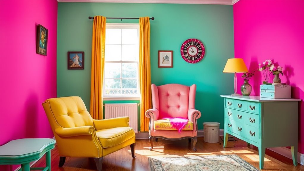
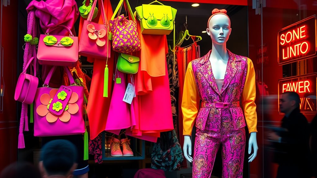
Color fads can turn into disasters if you ignore timing and cultural sensitivities. Bright, psychedelic hues in the 1960s quickly became outdated, while some colors linked to excess or political meanings backfired when misused. Cultural insensitivity, like choosing purple in a context tied to mourning, can offend or alienate your audience. Understanding these past mistakes highlights the importance of cultural awareness. Keep exploring, and you’ll discover how to avoid these common pitfalls altogether.
Key Takeaways
- Poor timing and misunderstood symbolism can turn trendy colors into costly failures.
- Ignoring cultural significance of hues risks offending audiences and causing backlash.
- Cultural missteps often cause color fads to flop due to insensitivity or misinterpretation.
- Trendy colors can become outdated or controversial quickly if their symbolism is misjudged.
- Cultural awareness and thorough research are essential to avoid color trend disasters.

Color fads often sweep through design and fashion, promising to refresh your style or home. But not every trend sticks, and some leave behind lessons in what to avoid. Historically, many color choices have failed spectacularly due to poor timing, misunderstood symbolism, or cultural insensitivity. These historical color failures serve as cautionary tales, reminding you that what seems fashionable in one era or context might become an embarrassing mistake in another. For example, in the 1960s, the obsession with bright, psychedelic hues seemed revolutionary, but as tastes shifted, those colors quickly became outdated and even associated with excess. Similarly, the infamous use of certain shades in political branding—like overly patriotic reds and blues—sometimes backfired when they carried unintended connotations or triggered cultural missteps. Recognizing the importance of cultural sensitivity can help prevent repeating these mistakes and choosing colors wisely.
Cultural missteps are often at the root of color fads that flop. When you ignore the cultural significance of certain hues, you risk offending or alienating your audience. Take the example of a designer who, in the 1980s, chose a shade of purple to evoke luxury, only to discover that in some Asian cultures, purple is associated with mourning. Or, think about how some colors, once considered modern and edgy, can become symbols of controversy or misunderstanding when used insensitively. These missteps aren’t just about choosing the wrong shade—they reflect a lack of awareness about cultural nuances that can turn a trendy color into a public relations disaster.
Frequently Asked Questions
Which Color Fad Caused the Most Financial Loss?
You might be surprised to learn that the pink color fad caused significant financial loss. Relying solely on color psychology in branding strategies can backfire if trends shift quickly. When companies overly invest in color fads, they risk alienating customers or losing relevance. To avoid this, focus on timeless branding strategies that resonate beyond fleeting color trends, ensuring your brand remains strong regardless of changing design fads.
How Do Color Trends Influence Consumer Behavior Long-Term?
Did you know that 60% of consumers say color influences their purchase decisions? Color trends shape your long-term behavior by creating a psychological impact and altering brand perception. When a trend catches on, it can boost brand loyalty or cause confusion if it flops. You might find yourself more attracted to brands that align with current color trends, ultimately affecting your buying habits and perceptions over time.
Are There Psychological Reasons Behind Color Fad Failures?
You might wonder if psychological reasons cause color fad failures. Color psychology plays a role in consumer perception, influencing how people respond to trends. When a color doesn’t align with current emotions or cultural associations, it can backfire, leading to disappointment. If a color feels off or doesn’t evoke the desired feelings, consumers lose interest, causing the fad to flop. Understanding these psychological cues helps predict which trends will succeed or fail.
What Industries Are Most Affected by Color Trend Flops?
You’ll find that retail branding and fashion marketing are the most affected by color trend flops. When a color fad fails, it can quickly diminish a brand’s appeal or cause costly rebranding efforts. You might see consumer confusion or loss of trust if a company heavily invests in a color that doesn’t resonate. Staying adaptable and understanding evolving preferences help you navigate these unpredictable trends effectively.
Can Color Fads Ever Be Successfully Revived Later?
Think of color fads as boomerangs—sometimes they come back in style. Yes, you can successfully revive them through retro revival and nostalgia marketing, tapping into consumers’ longing for past trends. Timing is key; reintroducing a color fad when it feels fresh and relevant can turn a flop into a hit. With the right strategy, what once failed can become a trendy comeback, dazzling your audience anew.
Conclusion
Just like Icarus soared too close to the sun, chasing fleeting color trends can lead you astray. These trendy disasters remind you that not every flash of popularity is worth diving into. Instead, trust your instincts and select colors that stand the test of time. Remember, true style isn’t about fleeting fads but about creating something enduring—like the classics that never fade, rather than chasing every shiny new hue that ultimately flops.


