
Choosing vintage-inspired or modern muted tones like soft greens, blues, or taupes can help your kitchen age better than bright white. These colors hide stains and wear more effectively and pair well with vintage accents for a timeless look. They create a balanced space that remains stylish over the years. If you keep exploring, you’ll discover how carefully selected colors can make your kitchen both durable and inviting for years to come.
Key Takeaways
- Muted vintage-inspired colors like soft greens and blues hide stains and wear better than bright white.
- Modern, subdued palettes such as charcoal gray or slate remain timeless and less trendy over time.
- Darker tones conceal fingerprints and blemishes, reducing visible aging and maintaining a cleaner look longer.
- Combining vintage accents with muted colors creates a warm, enduring aesthetic that ages gracefully.
- Thoughtful, versatile color choices provide a durable, stylish foundation that stays attractive beyond fleeting trends.
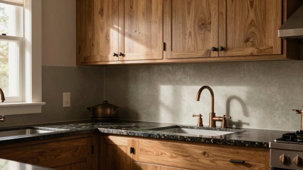
Have you ever wondered how the right kitchen color can transform your space? Choosing the right hue isn’t just about aesthetics—it’s about creating a timeless environment that ages gracefully and remains appealing over the years. While bright white might seem like a safe option, it often shows dirt and wear quickly, making it less ideal for a space you want to enjoy long-term. Instead, consider colors that balance vintage accents with modern palettes to craft a look that’s both fresh and enduring.
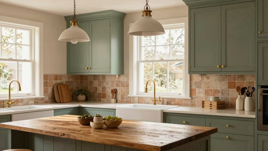
Opting for a color palette that blends vintage accents with modern palettes can give your kitchen a sense of warmth and character. Think muted greens, soft blues, or warm taupes—these shades evoke nostalgia while fitting seamlessly into contemporary design. Vintage accents in your decor—like antique handles, retro light fixtures, or classic tile patterns—complement these colors perfectly, creating a layered, curated feel. This approach not only adds personality but also helps your kitchen age well, as these hues tend to hide minor stains or scratches better than stark white. Incorporating biodiversity-friendly materials and finishes can further enhance the sustainability and resilience of your design choices.
Modern palettes, on the other hand, lean towards subtle sophistication. Think about incorporating shades like charcoal gray, slate, or muted terracotta. These colors serve as a versatile backdrop, allowing your vintage accents and accessories to stand out without overwhelming the space. When you combine these modern hues with vintage elements, your kitchen gains a timeless appeal that feels both current and rooted in history. Such combinations are less likely to look outdated as trends shift, offering longevity that bright white often lacks. Additionally, choosing timeless color schemes can help your kitchen remain stylish even as design trends evolve. Emphasizing color longevity ensures your investment continues to look fresh for years to come.
You also benefit from the practicality of these colors. Darker, muted tones tend to conceal fingerprints, smudges, and minor blemishes, making cleaning easier and maintaining a fresh look over time. Vintage accents—like aged brass fixtures or distressed wood—pair beautifully with these colors, enhancing their natural patina and character. Meanwhile, modern palettes with clean lines and understated hues create a sleek backdrop that highlights your vintage accents without competing with them, resulting in a balanced, harmonious space.
Ultimately, your choice of color should reflect your style and lifestyle, but leaning toward colors that combine vintage accents with modern palettes ensures your kitchen remains inviting and stylish for years to come. Instead of the fleeting appeal of bright white, these thoughtfully selected hues age gracefully, providing a durable, beautiful foundation for your culinary haven. Through this blend, you build a kitchen that feels timeless—warm, welcoming, and effortlessly chic, no matter how many years pass.
muted green kitchen paint
As an affiliate, we earn on qualifying purchases.
As an affiliate, we earn on qualifying purchases.
Frequently Asked Questions
How Do Darker Kitchen Colors Affect Cleaning and Maintenance?
Darker kitchen colors can make dirt and stains less visible, reducing the need for frequent cleaning. They tend to hide smudges and water spots better, making maintenance easier overall. However, be aware that some stains might be harder to spot and clean if they do appear. Choose stains-resistant finishes to keep your darker surfaces looking fresh longer, and regularly wipe down to prevent buildup and maintain their rich appearance.
Can Color Choices Influence the Overall Resale Value of a Home?
Your color choices can greatly influence your home’s resale value. Opting for classic, neutral shades like greys or warm taupes enhances kitchen appeal and maintains their look over time, thanks to good kitchen paint durability. These colors tend to attract more buyers because they’re versatile and timeless, positively impacting resale value. Bright whites can sometimes feel stark or trendy, risking quick obsolescence, whereas thoughtful color choices guarantee your kitchen stays appealing long-term.
What Are the Best Complementary Colors for Neutral Kitchen Palettes?
For neutral kitchen palettes, you should consider color pairing with soft blues, sage greens, or warm taupes, which enhance the space’s appeal. These choices boost mood enhancement, creating a relaxing and inviting atmosphere. You’ll find that subtle contrasts, like brushed gold or matte black accents, complement these colors beautifully. This combination not only elevates your kitchen’s style but also guarantees it ages gracefully over time.
How Does Lighting Impact the Appearance of Kitchen Paint Colors?
Lighting effects profoundly influence how your kitchen paint colors appear, making them seem warmer, cooler, or more muted. Natural light enhances true colors, while artificial lighting can alter their tone. It also impacts perceived paint durability over time, as well-lit areas show less wear. To keep your kitchen looking vibrant and consistent, choose lighting that complements your wall colors and consider how lighting effects will change their appearance throughout the day.
Are There Any Color Trends to Avoid for Long-Lasting Appeal?
You should avoid overly trendy hues that quickly go out of style, like certain bold or neon shades, as they can date your kitchen fast. Instead, opt for timeless options with vintage accents, such as muted greens or soft blues, which age gracefully. These colors blend well with evolving trends and maintain their appeal over time, ensuring your kitchen stays stylish without frequent repainting.

Vintage Metal Sign Stay Weird Wall Hanging Decorative Plaque 4×16 in for Home Farmhouse Bedroom Porch Vintage-Inspired Decor Fun Retro Sign for All Occasions
Vintage Metal Tin Sign: Crafted from durable metal, this 4×16 inch tin sign features a retro design that…
As an affiliate, we earn on qualifying purchases.
As an affiliate, we earn on qualifying purchases.
Conclusion
Choosing a timeless color for your kitchen isn’t just about style; it’s about creating a space that ages gracefully. Opt for hues that bring warmth and character over fleeting trends—after all, a wise person once said, “A thing of beauty lasts forever.” By selecting a classic, muted tone, you guarantee your kitchen remains inviting and elegant for years to come. Trust your instincts and remember, true beauty only deepens with time.
HORSTORS Kitchen Storage Cabinet, Modern Farmhouse Buffet Cabinet with Storage, Coffee Bar with 2 Drawers and 2 Doors, Floor Sideboard Buffet for Living Room, Dining Room, Bathroom, Ivory White
Belong To Your kitchen: The kitchen cabinet features 2 large door cabinets and 2 full extension drawers great…
As an affiliate, we earn on qualifying purchases.
As an affiliate, we earn on qualifying purchases.
Multilingual Cool Summer Palette Color Fan by Studio Immagine, Personalized Color Guide for Cost Saving, Smart Shopping, Outfit & Wardrobe Planning; Verano Frio/Verao Frio
FOUND YOUR COLOR IDENTITY — NOW WHAT?
As an affiliate, we earn on qualifying purchases.
As an affiliate, we earn on qualifying purchases.