
To master color blocking without overdoing it, stick to two or three bold hues and balance them with neutral tones like black, white, or beige. Use strategic placement, such as brighter colors on smaller areas and darker shades on larger surfaces, to maintain proportion. Incorporate contrasting colors thoughtfully and use patterns or textures to add depth. Want to refine your style further? Keep exploring how to blend bold hues seamlessly for a polished look.
Key Takeaways
- Limit your outfit to two or three bold, contrasting colors to maintain balance and avoid visual overload.
- Use neutral tones like black, white, or beige as a backdrop to let vibrant color blocks stand out subtly.
- Apply the one-third rule by placing bright colors on smaller areas or accessories to create focal points without overpowering.
- Incorporate patterns or textures with neutral pieces to add interest without clashing with bold color blocks.
- Balance bright hues with darker or muted shades in larger areas to keep the look polished and harmonious.
Understanding the Basics of Color Blocking

Understanding the basics of color blocking is essential to creating bold, eye-catching outfits. Color blocking pairs solid, bold colors in large, contrasting blocks to produce a striking visual effect. The key is choosing contrasting colors from the color wheel that complement each other through hue or luminance differences. Using neutral backgrounds like black, white, gray, or beige helps make your vibrant colors pop without overwhelming the look. To achieve harmony and balance, focus on proportion and repetition of colors across your garments. Effective color blocking relies on selecting the right contrast—whether it’s hue contrast or brightness contrast—to guarantee your outfit is visually appealing. Mastering these fundamentals lets you craft outfits that are both vibrant and cohesive, making style effortless and impactful. Incorporating color theory into your choices can further refine your ability to combine colors successfully. Additionally, understanding rustic decor elements can inspire complementary color schemes that enhance your overall aesthetic. Recognizing how farmhouse textiles utilize color palettes can also provide inspiration for pairing hues in your wardrobe.
Selecting the Right Colors and Schemes
When selecting colors, focus on choosing bold, contrasting pairs from the color wheel, like blue and orange or purple and yellow, to create eye-catching blocks. Balance these bright shades with neutral tones such as black, white, or beige to keep your look polished. Stick to specific color schemes like complementary or triadic to make sure your outfit remains cohesive and visually appealing. Incorporate color harmony principles to enhance the overall balance and aesthetic of your color blocking. Additionally, paying attention to visual weight can help create a more balanced and harmonious look, which is essential for effective relationship expression through fashion. Using appropriate color proportions ensures your color blocking remains attractive without overwhelming the overall outfit. To achieve a polished look, consider the decluttering of your wardrobe to better assess which colors and pieces work best together, simplifying your choices and enhancing your overall style.
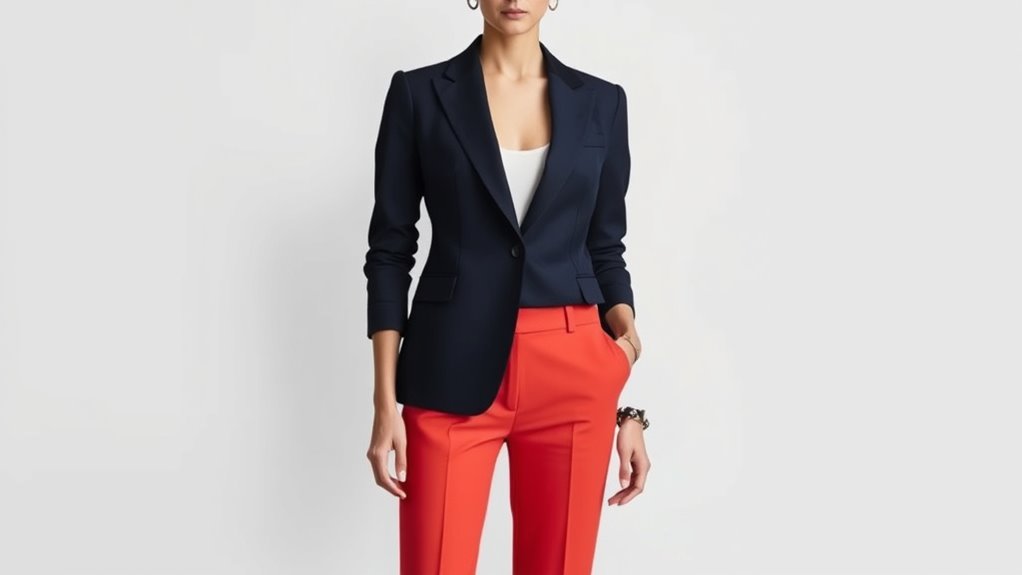
Choose Contrasting Colors
Are you wondering how to pick the right colors for a striking color block look? The key is to choose contrasting hues that catch the eye without clashing. Use the color wheel to find opposites like blue and orange or purple and pink for effective contrast. Pair bold, saturated colors with neutral or darker shades to make the hues pop. Mixing warm tones, like red or orange, with cool shades such as blue or green, creates a balanced, appealing palette. Limit your palette to two or three contrasting hues to keep harmony. Additionally, consider luminance contrast—pair bright, light colors with darker, muted tones for visual interest and cohesiveness. Incorporating innovative planters that feature vibrant colors can further enhance your color blocking design. Exploring different water features can also add depth and dynamic visual elements to your overall aesthetic. To ensure your design remains balanced, paying attention to visual hierarchy helps guide the viewer’s eye effectively. Being aware of environmental considerations can help you choose sustainable and eco-friendly materials for your project.
Use Color Schemes Wisely
Choosing the right color scheme is essential for creating a cohesive and visually appealing color block look. To achieve this, select color schemes like complementary, analogous, or triadic, ensuring your colors work harmoniously. Limit your palette to two or three bold colors paired with neutral tones such as black, white, or beige to keep the balance in check. Use the color wheel as a guide to pick contrasting or matching colors that complement your skin tone and personal style. Consider the mood you want to convey—calmness with blues and greens or energy with reds and oranges. Avoid overly bright or neon combinations unless making a bold statement; instead, opt for softer shades or muted tones within your chosen scheme to maintain sophistication. Additionally, understanding how contrast ratio affects visual clarity can help you create more balanced and visually appealing color blocks. Incorporating an awareness of sustainable color choices can also help in selecting schemes that are both visually pleasing and environmentally conscious. Being mindful of color psychology can further enhance the emotional impact of your color blocking.
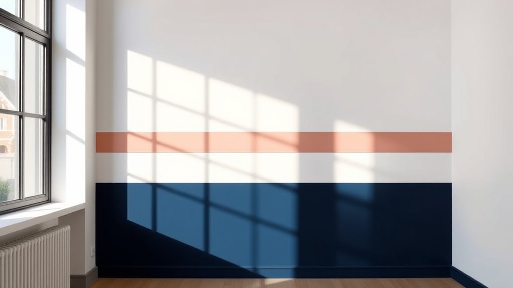
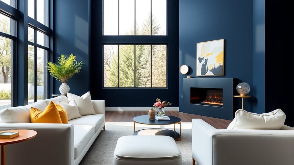
Balancing Bold Colors With Neutral Canvas Tones
Using neutral base colors like black, white, gray, or beige helps your bold hues pop without overwhelming your look. Limit yourself to two or three bright accents to keep the outfit balanced and cohesive. Incorporate black for contrast to add depth and polish to your color-blocked ensemble. Additionally, choosing proper venting techniques ensures your bold color choices are safely showcased without compromising overall harmony.
Use Neutral Base Colors
Neutral base colors like black, white, gray, beige, and navy create a versatile foundation that balances bold color blocks and keeps your outfit cohesive. Using neutral colors as base colors allows you to incorporate bright hues through accent pieces without clashing or creating visual chaos. These tones help ground vivid colors, making them more wearable and ensuring your overall look remains stylish and unified. When you pair bold colors with neutral backgrounds, you enhance contrast and draw attention to the color accents. Incorporating neutral base colors also simplifies your styling process, making it easier to experiment with bold color combinations while maintaining a balanced look. This approach ensures your outfit is lively yet polished, striking the perfect harmony between vibrancy and sophistication.
Limit Bright Color Blocks
To create a balanced look with bold color blocks, it’s important to limit their presence in your outfit. Bright colors can be striking, but overdoing it can overwhelm your look. Keep your outfit grounded with neutral tones like black, white, gray, or beige, which act as a canvas for your color combinations. Incorporating expert advice from fashion professionals can further guide you in achieving a harmonious balance. Here are three ways to do that:
- Use one or two bright colors as statement pieces, such as a jacket or top, and keep other items neutral.
- Spread out bright colors with neutral accessories or layers to maintain harmony.
- Follow the one-third rule, ensuring bright color blocks occupy no more than a third of your overall outfit. Additionally, understanding how credit card insights can help you manage your personal finances may inspire you to balance bold choices with practicality in your wardrobe and budget. It’s also helpful to explore remote hackathons as a way to foster creativity and collaboration outside traditional environments, inspiring fresh ideas for your personal style and approach to challenges. This approach keeps your look polished and eye-catching without overdoing the bright colors.
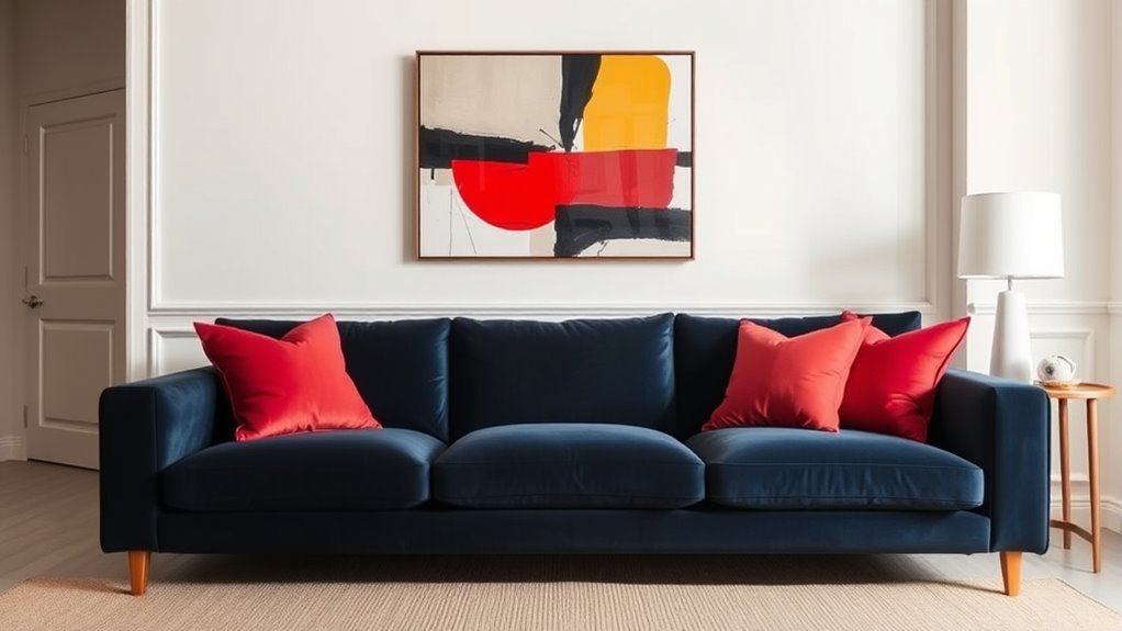
Incorporate Black for Contrast
Incorporating black into your outfit is an effective way to create contrast and balance bold color blocks. Black acts as a neutral base that grounds vibrant shades, making your look cohesive and polished. Use black accessories like shoes, belts, or bags to break up bright colors and add subtle contrast without overwhelming the ensemble. Incorporating black clothing, such as jackets or trousers, provides a versatile canvas tone that allows bold hues to pop. This neutral element helps prevent clashing or overwhelming visuals, keeping your outfit sophisticated. Relying on black as a neutral tone enhances your color blocking, making it easier to combine bold shades while maintaining a balanced, stylish appearance. It’s a simple yet powerful way to elevate your look. Dog names can also serve as a fun inspiration for creating personalized color blocking accessories or accents that reflect your style.
Using Contrast and Repetition for Cohesion

Using contrast and repetition effectively can make your color blocking outfits stand out while maintaining harmony. To achieve this, focus on three key strategies:
- Use contrasting colors, like blue and orange, from the color wheel to add visual interest without overwhelming your look.
- Repetition of a bold color across multiple pieces, such as your jacket and shoes, creates cohesion and prevents chaos.
- Incorporate neutral base tones, like black or white, to let contrasting colors pop while maintaining balance.
- Incorporating wall organization systems can help visualize how different colors work together, providing inspiration for cohesive color blocking.
Limiting yourself to two or three contrasting hues keeps your outfit clear and stylish. Repeating accent colors in accessories, like belts or scarves, reinforces cohesion, tying your entire look together seamlessly.
Incorporating Patterns and Textures Effectively

Balancing patterns and textures in your outfit guarantees visual interest without chaos. To achieve this, pair patterned pieces with solid, neutral items to prevent overwhelming the look. Opt for patterns with large shapes or lines, which act as self-contained color blocks, making color coordination easier. Use patterns to highlight a focal point, then repeat colors from the pattern elsewhere for a cohesive appearance. Avoid mixing multiple patterns with conflicting colors; instead, select patterns that incorporate hues already present in your outfit. Incorporate textures like knits, suede, or leather alongside color blocking to add depth without clashing visually. Recognizing the importance of interior design principles can help you create a balanced aesthetic in your outfits as well. This approach ensures your outfit remains balanced, engaging, and sophisticated, making effective use of patterns and textures without overdoing it. Additionally, understanding decorating strategies can inspire you to apply similar balance techniques in your interior spaces for a harmonious look.
Tips for Flattering and Suitable Color Placement

To achieve a flattering and well-balanced look, focus on placing colors strategically within your outfit. Proper color placement enhances your silhouette and creates harmony.
Here are key tips for flattering and suitable color placement:
- Use brighter, bolder colors on smaller areas like shoulders or waist to draw attention and create a flattering shape.
- Opt for darker or neutral shades on larger or more prominent areas to balance proportions and avoid visual overload.
- Apply the one-third rule in color blocking, ensuring bold colors occupy no more than one-third of your outfit to maintain harmony.
Keep contrasting colors strategically positioned to highlight your best features, while neutral accessories maintain focus on your carefully placed color blocks.
Common Mistakes to Avoid for a Polished Look
A common mistake when aiming for a polished look is overloading your outfit with more than two bold colors, which can quickly become chaotic rather than cohesive. Too many contrasting color blocks without balancing them with neutrals or darker tones make your outfit overwhelming. Wearing excessive accessories or patterns alongside bright hues distracts from the clean, sophisticated aesthetic you want. Ignoring the one-third rule by making bold colors the main focus or covering them with layers diminishes their impact. Additionally, combining neon or overly saturated shades with bright makeup or clashing patterns can make your look appear unrefined. To avoid this, stick to a simple color palette, balance bolds with neutral accents, and keep accessories minimal. This approach ensures your color blocking remains stylish and polished.
Frequently Asked Questions
What Are the Rules for Color Blocking?
When you ask about the rules for color blocking, focus on creating a balanced look. Use the color wheel to pick complementary or contrasting shades, keeping to two or three bold colors max. Stick with large, solid blocks instead of busy patterns, and add neutrals like black or white to tone things down. Keep accessories simple so your bold colors stand out without overwhelming your outfit.
What Is the 3 Color Rule?
The 3 Color Rule helps you keep your outfit balanced and visually appealing by limiting it to three main colors. You typically use one neutral, like black or beige, paired with up to two bold or accent colors. This approach prevents your look from becoming cluttered or overwhelming. While flexible, sticking to three colors makes it easier to create cohesive, stylish ensembles that stand out without overdoing it.
How to Get Better at Color Block?
Did you know that 78% of fashion experts agree that mastering color blocking boosts confidence? To get better, start small by using bold colors on key pieces, like a jacket, and pair them with neutral bottoms. Use the one-third rule to keep your outfit balanced and incorporate black or white to break up bright hues. Practice experimenting with different combinations, and over time, you’ll develop a refined, eye-catching style.
Is Color Blocking Hair Out of Style?
You ask if color blocking hair is out of style. While bold, high-contrast color blocking isn’t as trendy as it was in the early 2010s, softer and pastel shades have gained popularity for a more modern, subtle look. Today, many opt for integrated techniques like balayage or ombre that mimic color blocking without overwhelming. So, it’s still fashionable, but you might want to tone it down to stay aligned with current trends.
Conclusion
Now that you know how to use color blocking confidently, remember to balance boldness with subtlety, contrast with harmony, and patterns with simplicity. Embrace experimentation, refine your choices, and avoid overdoing it. Keep it fresh, keep it fun, and keep it stylish. With these tips, you’ll master color blocking effortlessly, creating looks that are vibrant, polished, and uniquely yours. So go ahead, make your wardrobe pop with purpose and flair!